Introduction:
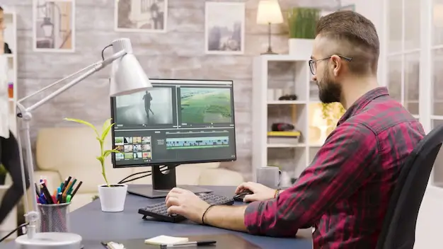
In the digital world of today, visuals are everything. Whether you’re designing a marketing banner, social media post, website layout, or product packaging, high-quality edited images are essential to creating professional and impactful designs. As a graphic designer, knowing how to apply basic photo editing techniques gives you the creative control to bring ideas to life.
This blog post explores the most important and widely used basic photo editing techniques every aspiring graphic designer must master. No matter what software you use — Adobe Photoshop, Lightroom, GIMP, or Canva — these techniques form the foundation of digital design.
1. Cropping and Straightening:
One of the most basic, yet powerful tools in any photo editing software is the Crop Tool. Cropping allows you to:
- Remove unwanted elements or distractions.
- Improve composition and focus on the subject.
- Adjust the aspect ratio for print or web layouts.
Pair this with straightening, and you can correct tilted images — particularly useful for architecture, horizon shots, or product photos that should appear perfectly aligned.
Pro Tip: Use the Rule of Thirds grid while cropping to achieve better visual balance.
2. Adjusting Brightness and Contrast:
Brightness affects the overall lightness or darkness of an image, while contrast determines the difference between the lightest and darkest areas.
- Increasing brightness can enhance visibility in underexposed photos.
- Increasing contrast can give your image a more dramatic, defined look.
Fine-tuning these settings helps to ensure that your images look clean, vivid, and professionally lit. Avoid extremes to prevent losing details.
3. Color Correction and White Balance:
Correct color tones are critical in design. Often, raw images may appear too cool (blue) or too warm (yellow). This is where white balance correction comes into play.
Use tools like:
- Temperature and Tint sliders.
- Color Balance, Levels, or Curves adjustments.
These help to:
- Achieve realistic and natural-looking colors.
- Match brand colors in product or promotional photography.
- Maintain visual consistency across your design project.
4. Saturation and Vibrance Control:
Saturation adjusts the intensity of all colors in an image. Over-saturation can make photos look artificial, while under-saturation makes them dull.
Vibrance is a more selective tool — it increases the intensity of less-saturated colors without overdoing already bright areas. It’s ideal for portraits or lifestyle images.
Graphic design tip: Use vibrance for subtle improvement; saturation when you want to make colors pop boldly.
5. Sharpening and Clarity:
Images often lose sharpness when resized or compressed for web. Adding sharpening can restore detail and make textures more prominent.
- Use the Sharpen Tool, High Pass Filter, or Clarity sliders.
- Focus on the eyes in portraits or the edges in product shots.
Caution: Over-sharpening can cause unwanted noise or halo effects. Apply it selectively.
6. Removing Blemishes or Unwanted Objects:
Whether it’s a skin blemish, dust particle, or background distraction, removing imperfections is essential. Use:
- Healing Brush or Spot Healing Tool
- Clone Stamp Tool
- Content-Aware Fill (Photoshop)
This technique is particularly useful in product photos, real estate images, and portraits. Clean backgrounds and surfaces make your design look polished.
7. Using Filters and Presets:
Filters and presets provide a quick and consistent way to stylize photos. In software like Lightroom or Canva:
- Presets are pre-defined adjustments that create a certain mood.
- Filters apply a uniform visual effect — warm, vintage, black & white, etc.
While they’re great time-savers, it’s important to adjust them based on your image’s specific lighting and tones. Avoid using default filters without tweaks.
8. Resizing and Resolution Settings:
Grasping image resolution is essential when optimizing visuals for various platforms and display formats.
- Use 300 DPI for print (e.g., brochures, posters).
- Use 72 DPI for web (e.g., social media, websites).
- Preserve the image’s natural proportions during resizing to prevent any warping or visual distortion.
Graphic designers should always ensure that images look crisp across all screen sizes and mediums.
9. Layer-Based Editing:
For non-destructive editing, especially in Photoshop or Affinity Photo, use layers:
- Keep the original photo intact.
- Apply edits on adjustment layers.
- Use layer masks for selective edits.
This gives you flexibility to revise, hide, or tweak changes without starting over — a must for professional design work.
10. Blurring and Depth of Field:
Adding a subtle background blur can help your subject stand out, especially in promotional or portfolio images. Use tools like:
- Gaussian Blur
- Lens Blur
- Field Blur (Photoshop)
You can simulate depth of field effects often seen in DSLR photography. This gives your image a more cinematic or premium look.
11. Text Overlay and Typography:
For social media or advertisement graphics, adding text is often necessary. Ensure your typography:
- Complements the photo style.
- Uses legible fonts.
- Stays within visual hierarchy.
Keep contrast in mind — light text over dark backgrounds, or vice versa. Use shadows or outlines for added visibility.
Design Hack: Apply slight blur or gradient under the text area for better readability without damaging the original photo.
12. Saving in the Right Format:
Finally, knowing which format to save your edited photo in is important:
JPEG – JPEG is ideal for everyday use, offering a balance between image quality and compact file size.
PNG – For images with transparency.
TIFF – High-quality format for printing.
PSD – Editable Photoshop file with layers intact.
Always keep a master copy before flattening or compressing your work.
Conclusion:
Mastering these basic photo editing techniques is the first step in your journey as a graphic designer. Clean, well-edited photos enhance your overall design quality, improve client satisfaction, and establish a professional brand image.
Don’t rush the process. With practice and a keen eye for detail, even simple adjustments can transform a plain photo into a stunning visual element in your design project.
Also Read: Making Simple Selections Easily