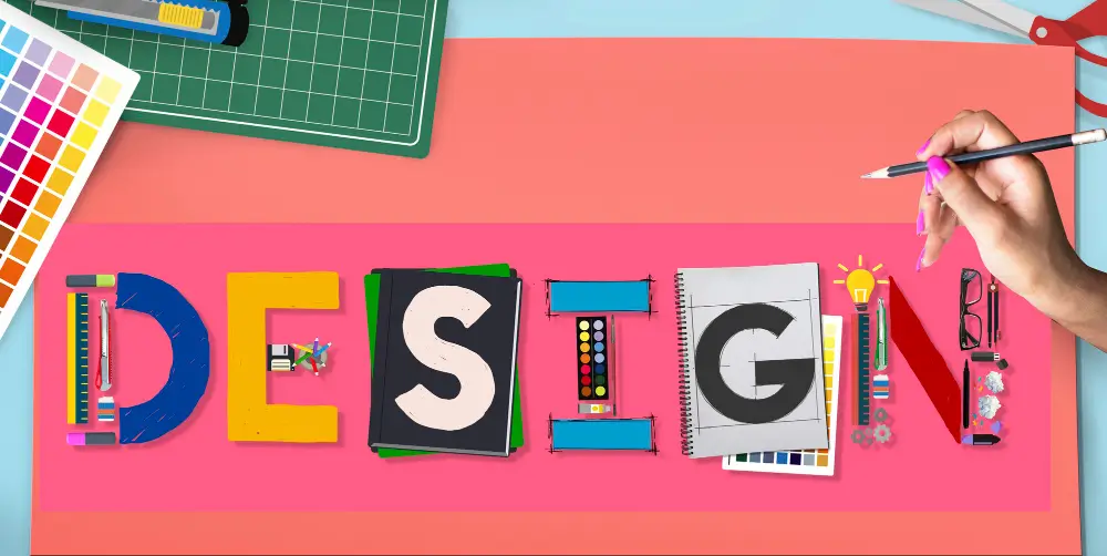
Building a Design Portfolio
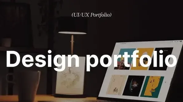
Introduction: In the competitive world of graphic design, talent alone isn’t enough. You need a powerful, polished, and purpose-driven portfolio to showcase your skills, style, and versatility. Your portfolio isn’t just a collection of work—it’s your brand’s visual resume, a demonstration of your design thinking, and often the first impression you make on potential clients or employers. Whether you’re a student, a freelancer, or a seasoned professional looking to refresh your presentation, this comprehensive guide will help you building a graphic design portfolio that stands out. Why a Strong Portfolio Matters: Your portfolio does more than display your abilities—it’s a visual story that captures your artistic evolution and unique approach to design. It shows how you approach a problem, craft a solution, and express creativity within a set of constraints. In the eyes of a client or employer, it communicates your aesthetic, your strengths, and your potential fit for a project or team. A well-crafted portfolio: Step 1: Define Your Goals and Audience: Before gathering your work, be clear about your purpose: After defining your objective, pinpoint the specific audience you aim to engage with your portfolio. A recruiter hiring for a product design role will look for different things than a small business owner looking for a logo designer. Ask Yourself: Step 2: Curate, Don’t Just Collect: One of the biggest mistakes designers make is including everything they’ve ever done. Instead, be selective. Your portfolio should show quality, not quantity. Focus on pieces that: Aim for 6–10 strong projects that demonstrate range, creativity, and impact. Include: Step 3: Tell the Story Behind Each Project: Don’t just upload the final image. Context matters. Each project should include: This structure shows your design thinking and sets you apart from designers who only show finished products. Step 4: Showcase Your Versatility & Strengths: If you’re a generalist, show variety: logos, brochures, websites, packaging, social media graphics, etc. If you’re a specialist, go deep into that niche. For example: Step 5: Keep It Visually Consistent: Your portfolio itself is a design project. Ensure the layout, typography, spacing, and navigation are all thoughtful and cohesive. Tips: Avoid clutter. Let your work breathe. Step 6: Choose the Right Format: You can create a digital portfolio, a PDF portfolio, or both. Online Portfolio Having your own website or using a dedicated portfolio platform is essential for showcasing your work professionally. You can use: Make sure your website: PDF Portfolio: Useful for job applications or in-person meetings. Keep it under 20MB. Use landscape orientation and optimized images. Step 7: Include a Strong About Page or Bio: Who are you as a designer? Your bio should be concise and compelling: End with a clear call to action—”Let’s work together” or “Reach out for collaborations.” Step 8: Add Testimonials & Case Studies: Social proof can elevate your credibility. Testimonials: Ask happy clients or mentors to write 2–3 lines about working with you. Include their name, role, and photo if possible. Case Studies: For 2–3 key projects, write detailed breakdowns showing how your design made a difference. This is especially powerful in UI/UX and branding work. Step 9: Update It Regularly: Designers grow fast. What was your best work a year ago might not represent you now. Set a reminder every 3–6 months to: Think of your portfolio as a living document, not a one-time creation. Step 10: Promote Your Portfolio: A great portfolio won’t help if no one sees it. Share it across platforms: Also, consider making a short portfolio reel or video walkthrough to engage viewers visually. Pro Tips for Portfolio Success: Avoid clutter: White space is your friend. Show your personality: Let your voice shine through. Include sketches or behind-the-scenes: Shows how you think. Use mockups: Present your work in real-world contexts. Be honest: If a project was a collaboration, credit others. Design the portfolio itself: Treat it like your proudest project. Conclusion: Building a design portfolio is essential for showcasing your skills, creativity, and design thinking. It helps potential clients and employers understand your style and strengths. A polished and cohesive portfolio leaves a memorable mark on viewers. Keeping it current and sharing it smartly boosts its reach. In the end, your portfolio is the face of your creative identity—craft it with purpose. Also Read: Smart Customer Management Solutions
Advanced Masking and Selections

Introduction: In the world of graphic design, precision is everything. Whether you’re creating composites, refining images, or isolating subjects, your ability to mask and make accurate selections defines the quality of your output. While beginners often rely on quick selection tools or the magic wand, advanced designers know that mastery of masking and selections opens doors to intricate, high-quality work that stands out. This article explores advanced techniques, best practices, and essential tools that professionals use to create flawless masks and precise selections across various graphic design platforms—primarily Adobe Photoshop and Illustrator. Why Masking and Selections Matter: Selections enable you to target and edit particular areas within an image while leaving the remaining content untouched. Masking, on the other hand, lets you hide or reveal portions of a layer non-destructively. Combined, they form the foundation of tasks like background removal, image blending, photo retouching, and complex compositing. Advanced techniques enable more nuanced control—crucial for hair selections, soft edges, transparent objects, or overlapping elements. Without refined selection and masking skills, even the most creatively inspired design can fall flat in execution. Key Concepts Behind Advanced Masking: Before diving into specific tools and techniques, let’s quickly cover some advanced masking concepts: 1. Non-Destructive Editing: Professional workflows require flexibility. Layer masks allow changes without permanently altering the original image. This way, you can revise, refine, or reverse your edits at any point in the design process. 2. Feathering and Edge Refinement: Softening edges is vital for natural blending. Feathering helps avoid hard transitions, while edge refinement adjusts the radius, contrast, and smoothing of your selection boundaries. 3. Channel-Based Masking: Channels contain black-and-white data that represent the brightness and color details within an image. By isolating the most contrasted channel (often Red, Green, or Blue), you can create detailed masks based on tonal differences—a favorite among professionals for hair and fine-edge selections. 4. Vector Masks vs. Layer Masks: Vector masks are resolution-independent, using paths to create clean, sharp edges—ideal for UI design and typography. Layer masks, on the other hand, rely on pixel data and offer soft transitions—perfect for photo work and digital painting. Advanced Selection Techniques: Let’s explore some powerful techniques and tools for making accurate, flexible, and refined selections. 1. Select and Mask Workspace (Photoshop): The “Select and Mask” panel in Photoshop is a go-to hub for advanced selections. It offers tools like: 2. Color Range Selections: This tool allows you to select pixels based on tone or hue. It’s excellent for selecting skies, skin tones, or similar color areas in an image. Use the “Fuzziness” slider to refine how strict or loose the color match is. 3. Luminance Masks (Channel Masks): Use the Channels panel to create a mask based on luminance. Duplicate the most contrast-heavy channel, enhance it with Levels or Curves, and then load it as a selection. This technique is unbeatable for delicate details like hair strands or transparent fabrics. 4. Pen Tool for Precision: While time-consuming, the Pen Tool offers pixel-perfect accuracy for selections with straight lines or smooth curves. It’s ideal for cutting out products, buildings, or any object with defined edges. The path can be saved, edited, and converted to a vector mask. 5. Quick Mask Mode: Quick Mask Mode lets you paint directly onto your image to refine selections manually. Use black to subtract and white to add. It’s especially useful for areas where automatic tools fail or need fine-tuning. Real-World Use Cases: Understanding techniques is great, but knowing how to apply them makes all the difference. 1. Hair and Fur Selection: Use a combination of Select and Mask + Channel Masks. First, rough out the selection with the Quick Selection Tool. Then, launch the ‘Select and Mask’ panel to refine edges using the dedicated brush, and complete the process with a luminance-based mask for accurate edge definition. 2. Transparent Objects: For glass, smoke, or water, use blending modes in combination with masks. Duplicate the image, adjust contrast, and use that as a mask layer to retain the semi-transparency. Use a gentle brush to subtly blend edges and achieve a more natural, lifelike appearance. 3. Complex Background Removal: Start with Select Subject, refine with the Lasso Tool or Pen Tool, and use multiple layer masks to separate elements. Add shadows or lighting effects after isolating your subject to integrate it seamlessly into a new background. 4. Selective Color Adjustments: Looking to modify the color of a single element within your image? Use Color Range or a targeted Hue/Saturation adjustment layer, paired with a precise mask, to isolate and modify only that element—keeping the rest untouched. Tips for Flawless Masking and Selections: Zoom In and Out Frequently: Switching between close-up and full view helps catch missed edges or unnatural shapes. Use Layer Comps: Save different masking stages or variations within the same file for comparison. Create Backups: Duplicate layers before masking, so you always have a fallback. Test on Contrasting Backgrounds: Place a solid white, black, or color background behind masked objects to spot edge errors. Use a Graphics Tablet: Painting masks with a pressure-sensitive stylus allows for greater control and subtlety. Software Tools Beyond Photoshop: While Photoshop is the gold standard for raster-based masking, several other tools and platforms offer advanced selection features: Adobe Illustrator: Ideal for vector masking, using the Clipping Mask or Opacity Mask features. Affinity Photo: Offers powerful masking options, including live filters and edge refinement tools. GIMP: GIMP is a free, open-source tool that offers features like layer masking, channel-based selections, and vector path masking capabilities. Procreate: Popular on iPad, it allows layer masking with brush-based control and Apple Pencil support. The Future of Masking: AI and Automation: With AI-powered tools like Adobe Sensei and selections in Photoshop’s newer versions, masking is becoming smarter. Features like “Select Subject” and “Remove Background” use machine learning to generate usable masks in seconds. However, while automation speeds up the process, it’s not flawless. Professional designers must still understand how to refine and control results manually to maintain creative and technical excellence. Conclusion:
Professional Poster Design Techniques

Introduction: In the fast-paced world of visual communication, poster design remains one of the most compelling tools for grabbing attention, conveying messages, and influencing audience behavior. Whether it’s for a product launch, an upcoming event, or a social campaign, a well-designed poster can speak volumes in seconds. But crafting a professional-level poster requires more than just slapping text and images together — it’s a blend of strategy, creativity, and technical know-how. In this article, we’ll explore professional poster design techniques that every graphic designer should master to create impactful, print- and web-ready posters. 1. Start with a Strong Concept: A professional poster begins with a clear concept. What’s the message you’re trying to convey? Who is your target audience? Are you promoting, informing, or inspiring? Tip: Ask yourself three key questions before starting: Creating a mood board or sketching thumbnails helps you explore creative directions before diving into the software. 2. Understand Poster Dimensions and Resolution: Before designing, always define the size and resolution. Posters come in various standard sizes such as A3, A2, 11″x17″, or custom dimensions depending on usage. Also, set up bleed and margin guidelines to avoid losing essential elements during trimming or cropping. 3. Hierarchy is Everything: Visual hierarchy is what makes a poster readable and scannable. The viewer’s eye should naturally flow from the most important information to the least. Design with the following hierarchy in mind: Leverage variations in scale, spacing, color, and contrast to purposefully direct the viewer’s focus throughout your poster design. 4. Use Typography with Intention: Typography can make or break a poster. It’s not just about selecting beautiful fonts — it’s about using type to amplify the message. Best Practices: Pro Tip: Combine a striking sans-serif font for headings with a refined serif for body copy to achieve a polished and well-balanced design aesthetic. 5. Master the Use of Color: Color is a powerful tool in poster design. It influences mood, conveys meaning, and draws attention. Tips for using color professionally: Also, always check color values for print vs. digital. Use CMYK for print and RGB for screen. 6. Use a Grid to Align Elements: A grid system brings structure and consistency to your layout. It helps align text, images, and graphics in a visually pleasing way. Grids are especially important when designing posters with lots of content or when working in teams to ensure consistency. 7. Incorporate High-Quality Imagery: Whether you’re using illustrations, photos, or custom graphics, the visuals must be high-resolution and relevant. Pro Technique: Use blending modes and adjustment layers in Photoshop or Illustrator to creatively integrate text and visuals. 8. Whitespace Isn’t Wasted Space: Many novice designers try to fill every inch of the poster, but negative space (aka whitespace) is critical in professional design. Don’t be afraid to let your design “breathe.” Minimalism, when done right, often feels more premium and sophisticated. 9. Use Consistent Branding: If you’re creating posters for a business or a recurring event, branding matters. Ensure consistency in: Consistency builds recognition and trust — vital for marketing success. 10. Test for Legibility and Visibility: Once your poster is complete, zoom out or print it to see how it looks from a distance. The headline should be readable from at least 6–10 feet away. Check: Use mockups or real-world simulations to test how it would appear on walls, digital kiosks, or mobile screens. 11. Optimize for Print and Digital: Prepare separate versions if your poster will appear in both physical and online spaces. Professional designers always tailor outputs based on the final medium to preserve quality and impact. 12. Seek Feedback and Iterate: Design is a collaborative process. Before finalizing the poster: Fresh eyes can often spot issues you’ve become blind to after hours of editing. Conclusion: Mastering professional poster design techniques takes time, experimentation, and a deep understanding of design principles. But once you’ve internalized the rules — and learned when to break them creatively — you’ll be able to craft posters that captivate, communicate, and convert. Whether you’re designing for a global brand or a local art fair, every poster is an opportunity to leave a lasting impression. So the next time you start a poster project, remember: concept first, hierarchy second, and design with purpose. Also Read: Advanced Masking and Selections
Mastering Color Correction Tools
Introduction: In the world of graphic design, colors do more than just decorate — they communicate. A poorly corrected image can throw off an entire composition, distort branding, or undermine the clarity of a visual message. That’s why mastering color correction tools is a critical skill for any serious graphic designer. From enhancing product photos to refining illustrations or prepping designs for print and digital platforms, color correction ensures visual accuracy and creative impact. This comprehensive guide will walk you through the essentials of color correction in graphic design — what it is, why it matters, and how to master the tools available in your software arsenal. What is Color Correction in Graphic Design? Color correction in graphic design refers to the process of adjusting an image’s or visual element’s color properties to ensure they appear balanced, accurate, and visually consistent with the design’s goals. Unlike color grading, which adds creative tones or moods, color correction focuses on fixing technical imperfections — like improper white balance, color casts, flat contrast, or inaccurate hues. Why It Matters: Brand Consistency: Accurate brand colors across all materials. Professionalism: Balanced images enhance perceived quality. Clarity: Correct contrast and saturation improve readability. Accurate Printing: Guarantees that on-screen designs retain their intended colors and quality when transferred to print media. Understanding the Color Theory Basics: Before diving into tools, a foundational understanding of color theory is crucial. In graphic design, you’re not just correcting colors to look “natural” — you’re correcting them to fit a design system. Key Concepts: RGB vs. CMYK: RGB is tailored for digital visuals, while CMYK caters to print outputs — both require unique color adjustments suited to their platform. Hue, Saturation, Brightness (HSB): define color properties — hue indicates the shade, saturation controls vividness, and brightness sets lightness. Color Harmony: Complementary, analogous, triadic — use these schemes to guide your corrections. Color Psychology: Color influences mood and perception, making it a vital element in branding, advertising, and product packaging strategies. Essential Color Correction Tools in Graphic Design Software: Whether you’re using Photoshop, Illustrator, Affinity Photo, or CorelDRAW, most professional design tools include similar correction features. Here are the key tools every designer should master: 1. White Balance Adjustments: Corrects color temperature and tint to neutralize unnatural lighting. Useful in correcting images shot under fluorescent or mixed lighting. Where to find it: 2. Levels and Curves: Levels: Adjust black, mid, and white points. Useful for contrast correction. Curves: Offers precision control over tonal ranges (shadows, midtones, highlights) in RGB or individual color channels. Pro Tip: Use the Gray Point Eyedropper in Levels to remove color casts instantly. 3. Hue/Saturation: Adjust the overall or selective saturation of colors. Useful for muting oversaturated reds or enhancing dull blues. Advanced Tip: Use the drop-down menu in Photoshop’s Hue/Saturation panel to target specific colors (e.g., only yellows). 4. Color Balance: Modify tones in shadows, midtones, and highlights by adjusting red/cyan, green/magenta, and blue/yellow channels. Ideal for correcting odd skin hues or unwanted color casts caused by lighting conditions. 5. Selective Color: Precisely tweak individual colors without affecting others. Excellent for matching brand colors, tweaking product hues, or isolating design elements. 6. Gradient Maps: Maps grayscale values to specific color ranges. Ideal for stylized poster design or creating consistent themes across compositions. 7. Blend Modes and Adjustment Layers: Use Soft Light, Overlay, or Color blending modes on adjustment layers for non-destructive corrections. Combine with masks to isolate corrections to specific parts of your layout. Color Correction Workflow in Graphic Design: To streamline your design process, follow a structured workflow. Here’s a simplified color correction pipeline suited for graphic design tasks: Step 1: Calibrate Your Monitor: If your screen isn’t displaying colors accurately, no amount of correction will help. Use tools like Datacolor Spyder or X-Rite Calibrite to ensure you’re seeing true colors. Step 2: Assess and Identify the Issues: Ask: Begin your assessment by referencing histograms, sampling with eyedroppers, and reviewing details in the info panel for accuracy. Step 3: Correct Exposure and Contrast First: Poor lighting affects color perception. Use Levels or Curves to correct tonal values before adjusting colors. Step 4: Balance Color Temperature: Adjust white balance by using sliders or the eyedropper tool, targeting neutral white or gray areas in the image as a reference point. Step 5: Fine-Tune Colors: Use Hue/Saturation, Color Balance, and Selective Color to refine the look. Stick to the project’s visual theme. Step 6: Apply Global and Local Adjustments: Use masks or vector shapes to isolate corrections to specific areas. For example, lighten the subject’s face without affecting the background. Real-World Graphic Design Applications: Branding and Identity Design: Maintaining consistent color accuracy across all visual assets is essential for brand recognition. Use color correction to match and standardize logos, headers, and product imagery. Marketing Materials and Ads: Correcting contrast and saturation in social media banners or print brochures ensures your message stands out. Product Mockups: Photographed mockups often need color correction to reflect the final product’s real-life color accurately. Web UI Design: Icons and interface graphics must be color-balanced to ensure accessibility and legibility, especially across different devices. Pro Tips to Master Color Correction in Graphic Design: Use Non-Destructive Editing: Work with adjustment layers, smart objects, or linked files to keep original assets untouched. Check Across Devices: Export mockups and view them on mobile, tablets, and different monitors to verify color consistency. Use Color Profiles: Assign appropriate color profiles (sRGB for web, CMYK for print) before final export to avoid shifts. Utilize Color Palettes: Tools like Adobe Color, Coolors, and Colormind help guide your design with harmonious tones. Create a Reference Board: Use mood boards with sample images that align with your project’s tone. They serve as visual anchors during color correction. Conclusion: In graphic design, color correction isn’t just a technical task — it’s a creative responsibility. It ensures your work communicates the right mood, message, and brand identity. By understanding how colors interact, and by mastering tools like Levels, Curves, HSL, and Selective Color, you can
Advanced Compositing in Photoshop
Introduction: In the world of graphics design and image manipulation, compositing is the technique that turns imagination into visual reality. Compositing is fundamentally the art of merging several images into one unified and visually consistent creation. While basic compositing may involve simple cut-and-paste techniques or placing a subject on a new background, advanced compositing in Photoshop is a meticulous process that blends elements with high precision, using light, color, shadows, perspective, and texture to create photorealistic or surreal visuals. Whether you’re a professional graphic designer, photographer, digital artist, or visual effects enthusiast, mastering advanced compositing opens the door to limitless creative possibilities. This blog post takes a deep dive into the tools, techniques, and mindset required to take your Photoshop compositing skills to the next level. What Is Advanced Compositing? Advanced compositing goes far beyond cutting out a subject and slapping it on a new background. It involves: In other words, it’s about making the fake look real — or even better, making the surreal look convincingly artistic. Step-by-Step Guide to Advanced Compositing: Let’s explore the process of creating a polished composite from scratch. 1. Conceptualization and Planning: Before opening Photoshop, have a clear vision. Sketch your idea or gather reference images. Ask yourself: Conceptualizing helps streamline your image search and ensures all elements feel intentional and cohesive. 2. Image Selection: Consistency Is Key: Choosing the right images is foundational. Ensure that: Stock photo sites often have similar series of images shot under the same conditions — take advantage of that to save time and effort. 3. Precise Selections with Advanced Tools: Use these tools for highly accurate selections: Pro Tip: Zoom in and clean up selections manually. A single stray pixel can ruin the illusion of realism. 4. Refine Edges Like a Pro: The difference between a beginner composite and a professional one often lies in edge treatment. To refine: Bonus Tip: While refining masks, toggle between black, white, and transparent backgrounds to reveal and fix even the smallest imperfections. 5. Lighting and Shadows: Lighting can make or break your composite. For advanced effects, use Lighting Effects (Filter > Render > Lighting Effects) or paint custom highlights using soft white brushes set to Overlay or Soft Light blend mode. 6. Color Matching and Grading: Each element in your composite may have a different color tone. To create harmony: Pro Tip: Add a subtle photo filter or gradient map at the end for a consistent color mood. 7. Depth, Blur, and Focus: To simulate camera-like realism, incorporate depth of field and blur effects. Tip: Use a depth map for more advanced blurring (Filter > Blur Gallery > Tilt-Shift or Field Blur). 8. Texture and Noise Matching: Digital noise or grain varies between images. To unify: This step ensures your image feels cohesive and doesn’t scream “Photoshopped.” 9. Environmental Integration: Environmental effects add believability. Blend effects using Screen or Lighten blend modes and lower opacity for subtlety. 10. Final Touches and Polish: Now that your elements are visually unified: Save your file in PSD format with organized layer groups for future edits. Bonus Tips for Flawless Compositing: Non-Destructive Editing: Use Smart Objects, masks, and adjustment layers. Avoid destructive edits that limit flexibility. Use Reference Images: Look at real photos to understand how light, shadows, and colors behave. Practice With Challenges: Try recreating famous movie posters or surreal artworks as practice. Study Real Environments: Observe natural shadows, color transitions, and atmospheric perspective. Leverage Plugins: Consider tools like Nik Collection, ON1 Effects, or Topaz Studio for finishing touches. Conclusion: Advanced compositing in Photoshop is part technical skill, part artistic intuition. With patience and practice, you can transform multiple disjointed images into seamless, storytelling masterpieces. From fantasy landscapes and cinematic scenes to commercial ads and editorial covers, the ability to composite at an advanced level gives you the freedom to create whatever you can imagine. So fire up Photoshop, gather your assets, and start composing — not just images, but powerful visual narratives. Also Read: Mastering Color Correction Tools
Basic Photo Retouching Tools

Introduction: Whether you’re a budding photographer, an aspiring graphic designer, or just someone who loves sharing polished pictures on social media, understanding the fundamentals of basic photo retouching tools is essential. The good news? You don’t need to be an expert to start retouching your photos like a pro. With just a few essential tools, you can dramatically improve image quality, enhance features, and remove distractions. In this guide, we’ll walk you through the basic photo retouching tools that are available in most popular image editing software such as Adobe Photoshop, Lightroom, GIMP, and more. Let’s dive in! 1. Healing Brush Tool: Erase Imperfections Effortlessly: The Healing Brush Tool is your go-to for removing skin blemishes, dust spots, scratches, and other unwanted imperfections. It works by sampling pixels from a clean area and blending them into the problem area, matching texture, lighting, and shading automatically. Ideal for: Acne, scars, wrinkles, dust, and lint. Pro Tip: Use a soft brush and adjust the hardness to blend seamlessly. Many programs offer variations like the Spot Healing Brush Tool (auto-samples pixels) and Patch Tool (lets you select the area to replace and drag to the source). 2. Clone Stamp Tool: Copy with Precision: Unlike the Healing Brush, the Clone Stamp Tool doesn’t blend—it directly copies pixels from one area to another. This gives you more control, especially when dealing with patterns or edges. Ideal for: Removing objects near complex backgrounds like textures or patterns. Pro Tip: Use this tool in tandem with the Healing Brush for best results. First clone, then heal. You can also adjust brush size and hardness for delicate retouching tasks like restoring old photographs or cleaning up detailed surfaces. 3. Dodge and Burn Tools: Sculpt with Light: Dodging (to lighten) and burning (to darken) are classic image enhancement methods that originated in traditional darkroom photo processing. In the digital realm, these tools help you enhance dimension and highlight details. Dodge Tool: The Dodge Tool is used to lighten specific parts of an image, making it ideal for enhancing eyes, teeth, and natural highlights. Burn Tool: The Burn Tool deepens selected areas of a photo, making it perfect for enhancing contours, adding shadows, and increasing visual depth. Pro Tip: Work on a duplicate layer or use a 50% gray layer in Soft Light mode for non-destructive editing. By subtly adjusting exposure in key areas, you can dramatically increase visual impact without altering the natural look. 4. Adjustment Layers: Non-Destructive Mastery: Adjustment Layers allow you to modify image properties like brightness, contrast, hue, and saturation without affecting the original image. These layers sit on top of your photo and can be edited or deleted at any time. Common adjustment layers include: Pro Tip: Use masks with adjustment layers to apply changes to specific parts of the image only. This flexibility ensures you can experiment freely without degrading your original photo quality. 5. Blur and Sharpen Tools: Control Texture and Focus: Sometimes, retouching involves softening harsh lines or bringing out detail. That’s where Blur and Sharpen tools come in. Blur Tool: Smooths out textures—great for skin retouching. Sharpen Tool: Enhances edges—useful for eyes, hair, or small objects. Pro Tip: Don’t overdo it. Over-sharpening can lead to noise, while over-blurring can cause unnatural plastic-like textures. Use with layer masks or duplicate layers to isolate effects and maintain realism. 6. Liquify Tool: Subtle Shaping and Adjustments: The Liquify Tool is powerful—maybe too powerful in the wrong hands. It allows you to push, pull, bloat, or shrink pixels to adjust shapes or proportions. Ideal for: Adjusting facial features, correcting posture, or fixing clothing folds. Pro Tip: Use the “Face-Aware Liquify” option in Photoshop for natural edits to eyes, nose, mouth, and jawlines. Aim for a natural touch—edits should blend seamlessly so the viewer focuses on the image, not the adjustments behind it. 7. Red Eye Tool: Fix Flash Photography Mishaps: Flash photos often result in an annoying red-eye effect. The Red Eye Tool automatically detects and corrects this by darkening the pupil area. Pro Tip: Zoom in for precision and avoid editing areas too aggressively, which can lead to a fake look. This tool is straightforward but highly useful for event or party photographers. 8. Crop and Straighten Tool: Perfect the Composition: Retouching isn’t only about skin and colors. Sometimes, just cropping and straightening your image can elevate it significantly. Crop Tool: Removes distractions, focuses attention, and follows the rule of thirds. Straighten Tool: Fixes tilted horizons or slanted subjects. Pro Tip: Use overlays (like the golden ratio or triangle) while cropping to improve compositional flow. A well-executed crop can transform an ordinary image into one that looks polished and professionally composed. 9. Brush Tool: Manual Control for Touchups: The Brush Tool isn’t just for painting—it’s often used with masks or adjustment layers for precise local edits. You can manually dodge, burn, desaturate, or recolor using different blend modes and opacities. Pro Tip: Combine with pressure-sensitive tablets for natural brush strokes and more finesse in retouching. Custom brushes can also be used to add makeup, shadows, or texture depending on your creative needs. 10. Noise Reduction and Clarity Adjustments: High ISO or low-light shots often introduce digital noise—those grainy artifacts that ruin detail. Most editing software includes Noise Reduction sliders under details or effects tabs. Noise Reduction: Softens grain and reduces color specks. Clarity: Adds midtone contrast and sharpness. Pro Tip: Balance is key—too much noise reduction removes fine detail, and too much clarity can make portraits look harsh. Always zoom to 100% to inspect how your changes affect skin and surface textures. Conclusion: Photo retouching is a valuable technique that elevates both the visual appeal and overall effectiveness of your images. With basic tools like the Healing Brush, Clone Stamp, and Adjustment Layers, even beginners can make noticeable improvements. These tools help correct imperfections, enhance details, and refine composition. Successful retouching depends on a careful balance of finesse and attention to detail. Always work non-destructively and maintain the photo’s natural feel. Consistent practice
Smart Objects and Filters in Photoshop
Introduction: In the ever-evolving world of graphics design, efficiency, flexibility, and non-destructive editing are key to delivering high-quality results. Whether you’re a graphic designer, photo editor, or digital artist, understanding how to use Smart Objects and Filters in Adobe Photoshop can significantly elevate your workflow. This post will take you through the fundamentals, advantages, and practical uses of Smart Objects and Filters, giving you powerful tools to enhance your creative process. What Are Smart Objects? Smart Objects in Photoshop are special layers that preserve an image’s original data, allowing for non-destructive editing. They act like protective containers that hold raster or vector content from files like JPEGs, PNGs, or Illustrator artwork. This means you can resize, rotate, or apply effects without permanently altering the original image quality. Smart Objects support linked updates and can contain multiple layers or designs. They are crucial tools for achieving adaptable, undo-friendly, and professional-grade editing processes. In simpler terms, Smart Objects allow you to: You can think of them as protective containers around your layers, keeping the original data intact no matter how many changes you make. How to Create a Smart Object: Creating a Smart Object in Photoshop is incredibly easy: Alternatively, Go to the Layer menu, hover over Smart Objects, and select “Convert into Smart Object” to transform your layer non-destructively. You’ll notice a small icon in the layer thumbnail—this confirms the layer is now a Smart Object. Why Use Smart Objects? 1. Non-Destructive Editing: Smart Objects are perfect for non-destructive workflows. Any filters, transformations, or adjustments applied to a Smart Object can be reversed or modified later. 2. Quality Preservation: Normally, scaling a raster image down and then back up leads to pixelation. But with Smart Objects, the image quality remains untouched because the transformations are not directly applied to the original layer. 3. Smart Filters Compatibility: Only Smart Objects support Smart Filters, which are non-destructive filters that can be edited, hidden, or removed at any time. 4. Linked Assets: You can use Smart Objects to embed Illustrator files, logos, or icons as linked assets. When the source file is updated, the changes automatically reflect in your Photoshop document. What Are Smart Filters? Smart Filters are filters applied to Smart Objects. Smart Filters differ from standard filters by offering complete editability and preserving the original image through non-destructive adjustments. When you apply a filter to a Smart Object, it appears below the layer in the Layers panel, and you can: This gives you incredible flexibility compared to traditional, destructive filter applications. How to Apply a Smart Filter: To add a Smart Filter to your layer in Photoshop, simply follow the steps outlined below for a smooth, non-destructive workflow. Once applied, the Smart Filter appears under the layer name, and a filter mask is automatically added for selective visibility. Benefits of Using Smart Filters: 1. Editable Settings: You can go back at any time and tweak the settings. This is ideal for effects like blur, noise, or artistic filters that need adjustment. 2. Layer Mask Integration: Each Smart Filter comes with a built-in mask, allowing you to hide or reveal the effect on specific parts of the image using black-and-white masking techniques. 3. Stackable Filters: You can apply multiple filters to the same Smart Object, reorder them, or even toggle their visibility—just like layers. 4. Reversible Design: Want to remove the effect entirely? Just delete the filter or disable it. The original image remains untouched, as all edits are applied without making lasting alterations. Common Use Cases for Smart Objects and Filters: 1. Applying Reusable Effects0: Let’s say you’ve created a mockup and want to apply the same shadow and blur effects to multiple elements. Smart Objects make it easy to duplicate and reuse the same settings across all instances. 2. Working with Mockups: Designers often use Smart Objects to insert content into mockup files (like business cards or t-shirts). You can double-click the Smart Object, update the design, and see it auto-update in the mockup. 3. Nondestructive Retouching: Use Smart Filters like Camera Raw, Dust & Scratches, or Gaussian Blur on a Smart Object to fine-tune portraits or backgrounds without permanent changes. 4. Applying Liquify or Warp Effects: Using Liquify on a Smart Object means you can come back and re-adjust the warping later—perfect for body or face editing. Linked vs Embedded Smart Objects Embedded Smart Objects: These are stored directly within your PSD file. They make your file larger but are self-contained and portable. Linked Smart Objects: These reference an external file. They reduce PSD size and allow updates across multiple files, but you must keep the external files in place. Use linked Smart Objects when working in a collaborative environment or when managing multiple assets across different documents. Tips and Best Practices: Name Your Smart Objects: When working with complex files, naming your Smart Object layers helps keep things organized. Convert Before Applying Filters: Always convert to a Smart Object before applying filters if you want the ability to tweak or remove them later. Use Smart Filters with Masks: Use the filter mask to apply effects only where needed. Use a soft brush with black color to hide unwanted filter areas. Avoid Nesting Too Deeply: While Smart Objects can contain other Smart Objects (nesting), avoid going too deep. Too many layers of nesting can confuse your workflow and make edits harder. Limitations to Be Aware Of: While Smart Objects and Filters are powerful, they have some limitations: Conclusion: Smart Objects and Smart Filters are more than just advanced features—they’re essential tools for any serious designer or photo editor using Photoshop. They give you unprecedented control, flexibility, and precision over your edits, helping you build a non-destructive and professional-grade workflow. If you’re still using destructive methods, now’s the moment to switch to Smart Objects—you’ll soon question how you ever worked without them. Also Read: Basic Photo Retouching Tools
Designing Social Media Graphics

Introduction: Designing social media graphics is a powerful way to capture attention and convey messages quickly in today’s fast-scrolling digital world. With millions of posts shared daily, eye-catching visuals can make your content stand out and drive engagement. Whether you’re promoting a product, sharing a quote, or telling a story, well-designed graphics help reinforce your brand identity. Each platform has unique dimensions and audience behavior, making customization essential. Effective design combines creativity with strategy, ensuring your message is both appealing and clear. Consistency in style, color, and typography builds recognition and trust. In short, great graphics make your content memorable and impactful. Why Social Media Graphics Matter: Visual content has proven to drive more engagement than text alone. According to studies: Social media graphics help with: In short, strong visuals = stronger communication. Understanding Your Goals and Audience: Identifying your objectives and knowing your audience lays the groundwork for impactful and strategic social media graphic design. It helps you create content that aligns with your purpose—whether it’s boosting engagement, driving sales, or increasing brand awareness. Knowing your audience’s preferences, interests, and behaviors allows you to tailor visuals that truly resonate. Clear goals guide your design choices, from color schemes to messaging tone. Without this clarity, even the best designs may miss the mark. Ask yourself: Understanding this helps you choose the right tone, colors, fonts, and imagery. Platform-Specific Design Tips: Each social media platform has different content styles, formats, and user behavior. Let’s break it down: 1. Instagram: 2. Facebook: 3. Twitter/X: 4. LinkedIn: 5. Pinterest: Design Principles to Follow: Creating social media graphics isn’t just about adding text over an image. Here are core principles every designer should follow: 1. Hierarchy: Arrange design elements strategically to lead the viewer’s focus—leverage scale, color contrast, and spacing to highlight important details. 2. Balance and Alignment: Maintain symmetry or asymmetrical balance depending on the vibe. Use grid systems to align elements cleanly. 3. Contrast: Contrast makes text readable and helps elements pop. Light text on dark backgrounds (or vice versa) increases impact. 4. Consistency: Use consistent fonts, colors, and design styles to maintain brand identity across all platforms. 5. Whitespace: Don’t clutter. Whitespace (empty space) allows the design to breathe and improves focus. Choosing the Right Tools: No matter your experience—pro designer or just starting out—there are design tools available to match every level of expertise. Beginner-Friendly Tools: Canva – Drag-and-drop templates, ideal for non-designers.Adobe Express – Lightweight tool for quick social posts.Crello (VistaCreate) – Rich template library and animation support. Professional Tools: Adobe Photoshop – Offers precise, professional-level control over each aspect of your design work.Adobe Illustrator – Great for vector-based social media icons and graphics.Figma – Collaborative design, perfect for teams and UI-heavy content. Tips for Crafting Engaging Social Graphics: 1. Use Brand Colors and Fonts: Ensure your visuals are easily identifiable by using your established color scheme and fonts—this strengthens brand recognition and builds audience trust. 2. Limit Fonts to Two: Using too many fonts creates visual confusion. A primary font for headlines and a secondary one for body text is sufficient. 3. Use High-Quality Images: Avoid pixelated, low-res visuals. Use stock libraries like Pexels, Unsplash, or premium options like Shutterstock for crisp images. 4. Add Your Logo Strategically: Watermark your content without being distracting. A small logo in a corner works well. 5. Incorporate CTAs: Add subtle Call-To-Actions like “Swipe Up,” “Tap to Learn More,” or “Save This Post” to guide your audience. Trends to Watch in 2025: Social media design is always evolving. Staying ahead of the curve keeps your content fresh and competitive. Kinetic Typography: Animated text adds movement and excitement to your graphics, ideal for reels and stories. 3D and Isometric Designs: Give your posts a modern edge with depth and dimension. Bold Gradients & Color Duos: Vibrant color transitions are back, especially for tech and lifestyle brands. Collage-Style Layouts: Mixing textures, cut-outs, and photography gives a creative edge, especially on Instagram. Dark Mode Friendly Designs: Designing graphics that look great in both light and dark modes ensures they’re device-adaptive. Optimizing for Engagement: Design is only part of the puzzle—distribution and strategy matter too. Also, always schedule posts during peak engagement times and repurpose graphics across platforms (with appropriate resizing). Common Mistakes to Avoid: Even seasoned designers slip into these traps: Fixing these mistakes ensures your content is polished, professional, and effective. Conclusion: Designing compelling social media graphics is both an art and a science. With the right tools, strategy, and creativity, you can craft visuals that not only stop the scroll but also drive real engagement. Remember, each graphic is a visual representation of your brand’s story. Make it count. Whether you’re a business owner, marketer, or designer, investing time in mastering social design will amplify your brand’s voice across the digital landscape. Also Read: Smart Objects and Filters in Photoshop
Creative Text Design Techniques
Introduction: In graphic design, text is not just a means of communication—it’s a powerful visual tool. Creative text design techniques help transform ordinary words into eye-catching elements that enhance the overall aesthetic of a project. Whether it’s a bold headline, a subtle caption, or an animated quote, the way text is styled can significantly influence user engagement. From custom typography to clipping masks and motion effects, these techniques allow designers to add personality and emotion to their work. Text can be playful, professional, dramatic, or minimal—depending on how it’s treated. Mastering these techniques is crucial for crafting impactful and visually engaging messages through design. Let’s explore the top techniques that make text both functional and artistic in design. 1. Use of Custom Typography: One of the best ways to make your text stand out is by using or creating custom typography. While default fonts serve functional purposes, custom typography adds personality and originality. Designers often hand-letter or digitally illustrate typefaces to give a brand or project a unique flair. Tip: You can use software like Adobe Illustrator, Procreate, or Fontself to create and refine your custom fonts. 2. Text Masking and Clipping Techniques: Text masking is a popular technique where an image, texture, or video is placed within the fill of the text. This method is especially effective for dynamic titles, travel posters, and event promotions. How to Do It: Using Photoshop or Illustrator, position the image layer directly on top of the text layer to begin the effect.Simply right-click on the image layer and choose the “Clipping Mask” option to embed it within the text. This embeds the image within the shape of the text, creating a vibrant, layered effect. 3. Gradient and Duotone Text Effects: Flat colors are great, but gradients can bring text to life. Gradient text gives a sense of depth, movement, and mood. Meanwhile, duotone effects apply two contrasting colors to a grayscale image or type, often used in modern magazine or music cover designs. Tools: 4. 3D and Isometric Text: Adding a 3D touch to text gives it dimension and makes it pop. You can either go the digital route using software like Blender or Cinema 4D, or apply faux-3D effects in Photoshop using layer styles like Bevel & Emboss, or by duplicating and offsetting layers. Isometric text, on the other hand, provides a geometric, technical look that’s great for infographics and futuristic designs. 5. Negative Space Typography: Negative space, or white space, refers to the empty area around or within text. Using negative space creatively can result in smart, visually impactful designs that communicate double meanings or hidden messages. Example: The FedEx logo cleverly hides an arrow between the “E” and “x”, showing speed and precision. 6. Kinetic Typography (Animated Text): Kinetic typography is the art of bringing text to life through motion in videos or animations. Ideal for promos, presentations, and social media, it adds energy and engagement. Designers can animate text to move, shift, rotate, fade, or scale in rhythm with audio or narration, creating a dynamic visual experience. Tools: 7. Layering Text Over Shapes and Photos: Overlaying text on images or geometric shapes creates contrast and improves readability while still keeping the design visually engaging. This is widely used in social media banners and UI headers. Tips: 8. Distorted and Warped Text: Warping allows you to twist, curve, or shape text into dynamic forms. This technique is useful in logos, album covers, or streetwear designs where a strong visual statement is required. Tools: 9. Text as a Design Element (Typographic Layouts): Instead of placing text simply as content, consider building an entire composition using typography. This method is known as typographic layout where type becomes both message and structure. Techniques: 10. Experimental Fonts and Pairing: Breaking the rules can lead to exciting results. Try pairing a bold display font with a minimal sans-serif for contrast. Or combine serif and script fonts to balance tradition and personality. Font Pairing Ideas: Use platforms like Google Fonts, Fontpair.co, or Adobe Fonts to explore reliable combinations. 11. Text with Motion Blur or Glitch Effects: Give your text a futuristic or digital vibe using glitch or motion blur effects. These are especially appealing for tech events, gaming posters, and cyberpunk-style themes. How to Create: 12. Interactive Text for Web Design: In modern web design, interactive text effects can enhance user engagement. Whether it’s hover effects, scroll animations, or dynamic content, interactive text helps guide the user’s attention and boosts conversion. Use: Best Practices for Creative Text Design: Regardless of the technique, consider these principles: Readability is Key: While creative design is important, it should never compromise readability—always evaluate font size, spacing, and color contrast for clarity. Consistency in Style: If you’re mixing fonts or effects, ensure consistency with your brand’s tone and design system. Hierarchy Matters: Use size, color, and weight to prioritize important messages. Balance and White Space: Don’t overcrowd your canvas. Space helps the text breathe and improves focus. Responsive Thinking: Always design with multiple screen sizes and devices in mind—especially for digital and web applications. Conclusion: Creative text design is more than just aesthetics—it’s about strategic visual storytelling. With techniques like custom typography, clipping masks, kinetic text, and smart font pairing, you can bring emotion, energy, and clarity to your designs. As a designer, constantly challenge yourself to think beyond just words—think of letters as shapes, voices, and visual instruments. Explore, experiment, and most importantly, keep practicing. Ready to bring your typography to life? Open up your design tool of choice and try out one of these techniques today! Also Read: Designing Social Media Graphics
Using Masks and Adjustments

Introduction: In the realm of graphic design, precision and flexibility are key. Whether you’re creating marketing materials, editing photos, or designing digital art, you need tools that allow you to make non-destructive changes and detailed edits. That’s where masks and adjustments layers and masks truly prove their value. These two powerful tools—often underutilized by beginners—can elevate your designs by allowing controlled, reversible, and highly flexible changes to your work. This comprehensive guide explores how to effectively use masks and adjustments in graphic designing, mainly focusing on tools like Adobe Photoshop, but the principles also apply across platforms like Affinity Photo, GIMP, and others. What Are Masks in Graphic Designing? At its core, a mask allows you to show or conceal areas of a layer non-destructively, preserving the original image data. Think of it like putting a stencil over an image—what you see through the stencil remains visible, and the rest is hidden. Types of Masks: 1. Layer Mask: 2. Clipping Mask: Why Use Masks? Non-Destructive Editing: Unlike erasing, using masks lets you hide content without permanently deleting it. Fine Control: You can blend images, apply selective adjustments, or highlight specific areas with precision. Editable Anytime: You can modify masks anytime in your workflow. Smooth Transitions: Create seamless effects using gradients or soft brushes on masks. How to Use Layer Masks in Photoshop (Step-by-Step): 1. Select the Layer: Choose the layer you want to apply a mask to. 2. Click ‘Add Layer Mask’ Button: This is found at the bottom of the Layers panel. A white preview box appears beside your layer, representing the newly added mask. 3. Choose a Brush Tool: Use a soft, round brush for smooth effects. 4. Set Foreground to Black: Painting black on the mask hides the layer’s content. 5. Paint Over Areas to Hide: You’ll notice those parts become transparent or reveal what’s underneath. 6. Use White to Reveal: Switch back to white to unmask or bring back hidden parts. Advanced Masking Techniques: 1. Gradient Masking: 2. Using Selections with Masks: 3. Invert the Mask: Adjustment Layers: The Power of Global and Local Edits: Adjustment layers allow you to apply effects like brightness, contrast, hue/saturation, levels, curves, and more—without altering the original image. Each adjustment layer comes with its own mask by default, allowing targeted edits with precision. Common Adjustment Layers: Brightness/Contrast: Enhances or dims your image with just two sliders. Great for quick fixes. Levels: Adjust the shadows, midtones, and highlights. Ideal for correcting exposure. Curves: Offers more refined tonal control compared to Levels. Hue/Saturation: Change specific colors in your design or desaturate an image for a grayscale effect. Color Balance: Adjust the balance between colors (cyan-red, magenta-green, yellow-blue) in shadows, midtones, and highlights. Using Adjustment Layers Effectively: 1. Add Adjustment Layer: To insert an adjustment layer, navigate to Layer > New Adjustment Layer or tap the half-shaded circle icon in the Layers panel. 2. Edit Properties: Each adjustment layer comes with properties you can tweak to achieve your desired effect. 3. Use the Built-in Mask: Just like a regular mask, use black, white, and gray to control where the adjustment appears. 4. Clip to a Specific Layer: To apply an adjustment only to the layer directly below, right-click the adjustment and select ‘Create Clipping Mask’. Combining Masks with Adjustments for Stunning Effects: The real magic happens when you combine masks with adjustments. For example: Selective Color Correction: Target the sky in a landscape shot by pairing a Hue/Saturation adjustment with a mask for precise color correction. Light and Shadow Enhancement: Apply Curves and mask to emphasize lighting on certain parts of a portrait. Vignetting: To produce a vignette effect, apply Levels or Curves alongside a radial gradient mask for subtle edge darkening. Practical Applications in Graphic Designing 1. Compositing and Image Blending: Use masks to blend multiple photos into a single cohesive composition—ideal for advertising or photo manipulations. 2. Highlighting Product Features: Apply an adjustment layer with a mask to draw attention to specific parts of a product in promotional graphics. 3. Creative Photo Editing: Turn photos into works of art by selectively enhancing areas using masks combined with adjustments like Color Balance and Curves. 4. Typography Effects: Use clipping masks to embed textures, gradients, or images within text, and enhance the effect with adjustment layers for custom color grading. Tips for Working with Masks and Adjustments: Name Your Layers and Masks: Helps keep your workspace organized, especially in complex designs. Use Feathering: Add feather to your mask edges for smoother transitions. Use Smart Objects: Convert layers to Smart Objects before masking, so you can preserve resolution and edit later. Zoom In When Detailing: High zoom helps while brushing masks on intricate designs or small areas. Combine with Blend Modes: Masks + adjustments + blending modes can create dynamic visual effects. Common Mistakes to Avoid: Forgetting to Select the Mask Thumbnail: Always click the mask thumbnail before painting, or you might accidentally paint on the image layer itself. Using 100% Hardness Brushes for Soft Transitions: Use soft-edge brushes for smoother and more natural blending. Overdoing Adjustments: Avoid extreme settings on adjustment layers unless you’re going for a specific stylized effect. Not Checking the Layer Stack: The order of adjustment layers and masks matters. Always double-check the stacking for the intended outcome. Conclusion: Mastering masks and adjustment layers is essential for every graphic designer. These tools allow you to work non-destructively, with more freedom to experiment, and with the precision needed for professional-level output. Once you integrate these into your everyday workflow, you’ll find your editing capabilities more refined, your compositions more compelling, and your design process significantly more flexible. As you continue to explore and practice, challenge yourself to use masks and adjustments not just for corrections—but also as creative tools for storytelling and emotional impact. The more you play, the more powerful your designs will become. Also Read: Creative Text Design Techniques