Introduction:
In graphic design, text is not just a means of communication—it’s a powerful visual tool. Creative text design techniques help transform ordinary words into eye-catching elements that enhance the overall aesthetic of a project. Whether it’s a bold headline, a subtle caption, or an animated quote, the way text is styled can significantly influence user engagement. From custom typography to clipping masks and motion effects, these techniques allow designers to add personality and emotion to their work. Text can be playful, professional, dramatic, or minimal—depending on how it’s treated. Mastering these techniques is crucial for crafting impactful and visually engaging messages through design. Let’s explore the top techniques that make text both functional and artistic in design.
1. Use of Custom Typography:
One of the best ways to make your text stand out is by using or creating custom typography. While default fonts serve functional purposes, custom typography adds personality and originality. Designers often hand-letter or digitally illustrate typefaces to give a brand or project a unique flair.
Tip: You can use software like Adobe Illustrator, Procreate, or Fontself to create and refine your custom fonts.
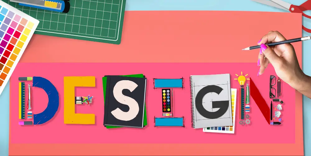
2. Text Masking and Clipping Techniques:
Text masking is a popular technique where an image, texture, or video is placed within the fill of the text. This method is especially effective for dynamic titles, travel posters, and event promotions.
How to Do It:
Using Photoshop or Illustrator, position the image layer directly on top of the text layer to begin the effect.
Simply right-click on the image layer and choose the “Clipping Mask” option to embed it within the text.
This embeds the image within the shape of the text, creating a vibrant, layered effect.
3. Gradient and Duotone Text Effects:
Flat colors are great, but gradients can bring text to life. Gradient text gives a sense of depth, movement, and mood. Meanwhile, duotone effects apply two contrasting colors to a grayscale image or type, often used in modern magazine or music cover designs.
Tools:
- Adobe Photoshop & Illustrator
- Web designers can apply gradient effects to text by using CSS with the background-clip: text; property for stylish visual impact.
4. 3D and Isometric Text:
Adding a 3D touch to text gives it dimension and makes it pop. You can either go the digital route using software like Blender or Cinema 4D, or apply faux-3D effects in Photoshop using layer styles like Bevel & Emboss, or by duplicating and offsetting layers.
Isometric text, on the other hand, provides a geometric, technical look that’s great for infographics and futuristic designs.
5. Negative Space Typography:
Negative space, or white space, refers to the empty area around or within text. Using negative space creatively can result in smart, visually impactful designs that communicate double meanings or hidden messages.
Example: The FedEx logo cleverly hides an arrow between the “E” and “x”, showing speed and precision.
6. Kinetic Typography (Animated Text):
Kinetic typography is the art of bringing text to life through motion in videos or animations. Ideal for promos, presentations, and social media, it adds energy and engagement. Designers can animate text to move, shift, rotate, fade, or scale in rhythm with audio or narration, creating a dynamic visual experience.
Tools:
- Adobe After Effects
- Canva Pro (basic animation)
- Figma (with plugins)
7. Layering Text Over Shapes and Photos:
Overlaying text on images or geometric shapes creates contrast and improves readability while still keeping the design visually engaging. This is widely used in social media banners and UI headers.
Tips:
- Use semi-transparent dark overlays behind light-colored text.
- Use blur backgrounds to keep the text readable while maintaining context.
8. Distorted and Warped Text:
Warping allows you to twist, curve, or shape text into dynamic forms. This technique is useful in logos, album covers, or streetwear designs where a strong visual statement is required.
Tools:
- In Illustrator, use the Envelope Distort feature.
- In Photoshop, go to Edit > Transform > Warp.
9. Text as a Design Element (Typographic Layouts):
Instead of placing text simply as content, consider building an entire composition using typography. This method is known as typographic layout where type becomes both message and structure.
Techniques:
- Use alignment and grid systems.
- Create texture using repeated words or rotated letters.
- Mix font weights and sizes to create hierarchy.
10. Experimental Fonts and Pairing:
Breaking the rules can lead to exciting results. Try pairing a bold display font with a minimal sans-serif for contrast. Or combine serif and script fonts to balance tradition and personality.
Font Pairing Ideas:
- Montserrat (Sans-serif) + Playfair Display (Serif)
- Lora (Serif) + Raleway (Sans-serif)
- Poppins (Modern) + Pacifico (Script)
Use platforms like Google Fonts, Fontpair.co, or Adobe Fonts to explore reliable combinations.
11. Text with Motion Blur or Glitch Effects:
Give your text a futuristic or digital vibe using glitch or motion blur effects. These are especially appealing for tech events, gaming posters, and cyberpunk-style themes.
How to Create:
- In Photoshop, duplicate the text layer.
- Individually add motion blur or apply an RGB color shift to each layer for a dynamic, distorted visual effect.
- Offset them slightly to simulate digital distortion.
12. Interactive Text for Web Design:
In modern web design, interactive text effects can enhance user engagement. Whether it’s hover effects, scroll animations, or dynamic content, interactive text helps guide the user’s attention and boosts conversion.
Use:
- CSS animations and transitions
- JavaScript libraries like GSAP or Three.js
- Webflow or Framer for no-code options
Best Practices for Creative Text Design:
Regardless of the technique, consider these principles:
Readability is Key: While creative design is important, it should never compromise readability—always evaluate font size, spacing, and color contrast for clarity.
Consistency in Style: If you’re mixing fonts or effects, ensure consistency with your brand’s tone and design system.
Hierarchy Matters: Use size, color, and weight to prioritize important messages.
Balance and White Space: Don’t overcrowd your canvas. Space helps the text breathe and improves focus.
Responsive Thinking: Always design with multiple screen sizes and devices in mind—especially for digital and web applications.
Conclusion:
Creative text design is more than just aesthetics—it’s about strategic visual storytelling. With techniques like custom typography, clipping masks, kinetic text, and smart font pairing, you can bring emotion, energy, and clarity to your designs.
As a designer, constantly challenge yourself to think beyond just words—think of letters as shapes, voices, and visual instruments. Explore, experiment, and most importantly, keep practicing.
Ready to bring your typography to life? Open up your design tool of choice and try out one of these techniques today!
Also Read: Designing Social Media Graphics