Introduction:
Figma has become one of the most powerful design tools for UI/UX designers, offering a plethora of features that make designing efficient and fun. One of the most fundamental aspects of any design, whether it’s for web, mobile apps, or branding, is color. Colors and gradients can transform the way your design feels, making it visually appealing, engaging, and even emotional. In Figma, using colors and gradients effectively can make all the difference in your design process.
In this guide, we’ll explore how to use colors and gradients in Figma, tips to implement them creatively, and best practices to ensure that your designs look polished and professional.
Understanding Colors in Figma:
Before diving into how to apply colors in Figma, it’s important to understand the basic color systems used within the app. Figma provides designers with several color management tools and features that help them stay organized and create visually consistent designs.
1. Color Picker:
The color picker in Figma is a straightforward tool that allows you to choose from a wide range of colors. When selecting an object or text, you can access the color picker in the right-hand panel. The color picker offers options to choose from:
Hue: The type of color (e.g., red, blue, yellow, etc.).
Saturation: The intensity or vibrancy of the color.
Lightness: How light or dark the color appears.
Opacity: Adjusting how transparent or opaque the color is.
These options give you complete control over creating the exact color you need for your design.
2. Color Styles:
Figma allows designers to define reusable color styles for their projects. Once you’ve created a color style, you can apply it across multiple elements within your design, ensuring consistency. To define a custom color style, simply follow these steps:
- Select an object (e.g., a shape or text).
- Click the color box in the right-hand panel.
- Choose the color you want to use.
- In the color picker, click the four dots icon and then “Create style.”
- Name your color style for future reference.
Color styles in Figma make it easier to maintain consistent color usage across your design, which is especially helpful when working on larger projects or collaborating with a team.
3. Hex, RGB, and HSL Color Models:
Figma supports different color models, and you can enter color values directly using:
Hex Code: A six-digit code representing a color (e.g., #FF5733).
RGB: Represents color values as red, green, and blue (e.g., rgb(255, 87, 51)).
HSL: Represents color values in terms of hue, saturation, and lightness (e.g., hsl(14, 100%, 60%)).
You can toggle between these modes directly in the color picker to make sure you’re working with the right color system for your project.
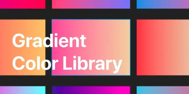
Working with Gradients in Figma:
Gradients are an excellent way to add depth, dimension, and richness to your designs. Whether you’re designing buttons, backgrounds, or even typography, gradients help make elements stand out. Figma’s gradient tools are powerful yet intuitive, allowing you to create complex gradient effects without needing to be a design expert.
1. Types of Gradients in Figma:
Figma supports different types of gradients:
Linear Gradient: A gradient that changes color along a straight line. It’s great for creating a smooth transition between two or more colors.
Radial Gradient: A gradient that radiates outward from a central point, usually creating a circular transition from one color to another.
Angular Gradient: A gradient that transitions colors in a circular motion around a center point, often used to create effects like color wheels or buttons with highlights.
Diamond Gradient: A gradient that transitions in a diamond pattern, useful for effects that require a sharp, geometric look.
2. Applying Gradients:
To apply a gradient in Figma, follow these steps:
- Select the shape or object you want to apply the gradient to.
- In the right-hand panel, under the “Fill” section, click the color box.
- Choose “Linear,” “Radial,” “Angular,” or “Diamond” from the gradient options.
- Select the colors you want to apply to the gradient by adjusting the color stops (the little circles on the gradient bar).
Drag the color stops to adjust the gradient direction, spread, or size.
This gives you a lot of flexibility in designing unique gradients that fit your style and project needs.
3. Using Multiple Color Stops:
Figma allows you to add multiple color stops to a gradient, which can create complex and rich effects. Each stop represents a point where the gradient transitions between colors, and you can move the stops closer together or further apart to control the smoothness of the transition.
To add a new color stop:
- Click anywhere on the gradient bar.
- Choose the color for that stop.
- Adjust the placement of the stop by dragging it along the bar.
- Experimenting with multiple color stops can help you achieve sophisticated gradients with subtle shifts in color, making your design stand out.
4. Gradient Opacity:
Figma’s gradient tool also allows you to control the opacity of each color stop. This is useful for creating more complex designs, such as overlays, semi-transparent buttons, or background effects.
To adjust the opacity:
- Select a color stop.
- In the color picker, adjust the “A” (alpha) slider to set the opacity of that specific color stop.
- Using gradient opacity can add a sense of depth or layering to your designs, making them more dynamic.
Best Practices for Using Colors and Gradients in Figma:
Now that you know the tools and techniques for working with colors and gradients in Figma, let’s explore some best practices to help you create better, more consistent designs.
1. Create a Color Palette:
One of the most important things to do when starting a design project is to create a color palette. A well-defined color palette ensures consistency throughout your design and helps create a unified visual experience. Use Figma’s color styles to organize your palette and easily apply it to elements in your design.
Consider using color palettes that are:
Balanced: Choose a primary color, secondary color, and accent colors.
Accessible: Use color combinations that are readable for people with color blindness.
Brand-Appropriate: Ensure your color choices align with the branding guidelines of your project or client.
2. Stick to Simple Gradients:
While gradients can add dimension and complexity, it’s important not to overdo them. Simple gradients with two to three color stops usually work best and create a more modern, clean look. Avoid using too many colors in a single gradient, as it can overwhelm your design.
3. Use Gradients for Depth, Not Distraction:
Gradients are great for adding depth, but they should never distract from the primary message of your design. Use gradients sparingly to highlight important elements or create emphasis without competing with other elements in the design.
4. Test Your Colors:
Figma has built-in accessibility tools that allow you to check the contrast ratio of your text and background colors. It’s essential to ensure that your design is legible for all users, including those with visual impairments. Always test the contrast ratio and adjust your colors as needed.
Conclusion:
Mastering the use of colors and gradients in Figma is an essential skill for any designer. With Figma’s robust color tools and gradient capabilities, you can create visually engaging, cohesive designs that resonate with your audience. Whether you’re designing buttons, backgrounds, or complete UI kits, understanding how to work with colors and gradients can elevate your design work and give it a professional edge.
By following best practices, staying organized with color styles, and experimenting with gradients, you’ll be able to craft stunning designs that are both functional and beautiful. Happy designing!
Also Read: Working with Vector Shapes in Figma