How to Add Product Categories
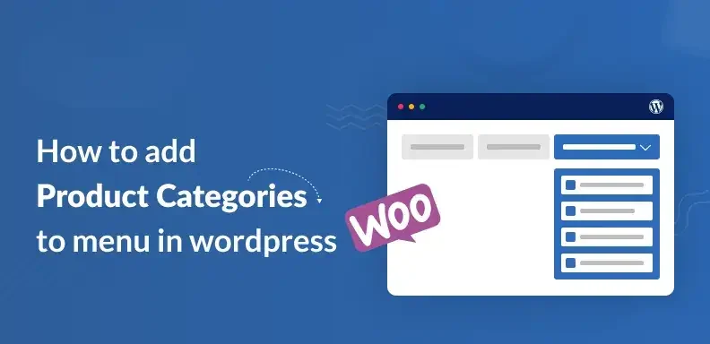
Introduction: Organizing your online store is crucial for both user experience and efficient management. One of the most effective ways to achieve this is by learning how to add product categories properly. Categories help group similar products together, making it easier for customers to browse and find what they’re looking for. Whether you’re running a fashion boutique, electronics store, or a multi-vendor marketplace, well-defined categories can significantly improve navigation. They also enhance your site’s structure, which boosts SEO and product discoverability. Understanding how to add product categories is essential if you want to scale your store smoothly. It allows for better inventory control, targeted marketing, and personalized shopping experiences. Most eCommerce platforms like WooCommerce, Shopify, and Magento offer intuitive tools for creating and managing categories. Still, applying the right methods is essential to prevent disorganization and ensure a smooth browsing experience. This article provides a detailed, step-by-step approach to organizing your store by adding product categories efficiently and correctly. What Are Product Categories? Product categories serve as structured tags used to group related items within an online store for easier navigation and management. For example, in an online fashion store, you might have categories like: Each of these might contain subcategories such as “T-Shirts,” “Jeans,” “Sneakers,” and so on. Categories help customers find what they’re looking for quickly and improve your store’s navigation, search functionality, and user engagement. Why Product Categories Are Important: Adding product categories is not just about keeping your store neat—it’s a strategic move that can drive conversions. Here’s why: Improved User Experience: Shoppers can browse through relevant sections easily, rather than being overwhelmed by an unstructured product list. Better Navigation: Categories form the basis of your site’s main menu and navigation systems. Increased Sales: Organized categories lead to faster product discovery, which can directly impact sales. Enhanced SEO: Search engines use category pages to understand your site structure. Optimized categories help improve rankings for relevant keywords. Streamlined Management: Makes it easier for store owners to manage inventory, apply discounts, or run targeted marketing campaigns. Step-by-Step: How to Add Product Categories: Let’s now break down how to add product categories on popular platforms. While the terminology might differ slightly, the overall process remains quite similar. 1. Adding Product Categories in WordPress (WooCommerce): If your store runs on WooCommerce, adding product categories is straightforward: 1. Log in to your WordPress dashboard. 2. Navigate to Products > Categories. 3. You’ll see a form with the following fields: 4. Click “Add new category”. 5. Assign products to this category by editing a product and selecting the category on the right-hand side. 2. Adding Categories in Shopify: Shopify handles categories a bit differently, using what it calls Collections. 1. From your Shopify admin, go to Products > Collections. 2. Click “Create Collection”. 3. Fill out the collection details: 4. Save the collection. 5. You can now assign products to this collection from the product editor or via automation rules. 3. Adding Categories in Magento: Magento uses a hierarchical category structure. 1. Access your Magento dashboard by signing into the admin panel. 2. Go to Catalog > Categories. 3. Click “Add Root Category” or “Add Subcategory” under an existing category. 4. Fill out required details: 5. Assign products to categories via the product settings under Catalog > Products. 4. Adding Categories in BigCommerce: 1. Navigate to Products > Product Categories. 2. Click “Add a Category”. 3. Input category name, URL, and description. 4. Arrange your categories into a structured hierarchy by simply dragging and dropping them into place. 5. Assign products to categories from the product detail page. Best Practices for Managing Product Categories 1. Keep It Simple and Logical: Avoid over-complicating things. If users need to click through five levels to find a product, they’ll likely leave. Two to three levels deep is ideal. 2. Use Clear, Descriptive Names: Use straightforward names that your customers understand. For example, “Laptops” is better than “Portable Devices.” 3. Avoid Redundancy: Don’t repeat categories or create duplicate subcategories unless necessary. For instance, avoid having “T-Shirts” under both “Men’s Clothing” and “New Arrivals” if not handled properly. 4. Use High-Quality Images for Categories: This adds visual appeal and helps users understand the category better, especially in grid-based layouts. 5. Optimize for SEO: Each category page should have: 6. Regularly Audit and Update: Product categories shouldn’t be static. Reevaluate categories based on user behavior, product additions, or seasonal changes. Mistakes to Avoid: Too many or too few categories: Don’t overwhelm or underserve users with disorganized menus. Inconsistent naming conventions: Capitalization, spelling, and formatting should remain consistent. Unassigned products: Ensure that each item in your store is linked to at least one relevant category. Forgetting about mobile users: Ensure category navigation is mobile-friendly and easy to tap through. Tips to Improve User Experience With Categories: Faceted Filters: Allow users to filter within categories by price, size, brand, color, etc. Breadcrumb Navigation: Provides users with a clear path of their location and an easy way to return to previous pages. Highlight Popular Categories: Use your homepage or sidebars to spotlight best-selling or seasonal categories. Conclusion: Knowing how to add product categories—and doing it the right way—is foundational to running a successful online store. It’s not just about backend organization but about delivering a seamless and satisfying shopping experience for your customers. Whether you’re using WooCommerce, Shopify, Magento, or any other eCommerce platform, the key principles remain the same: be clear, organized, and user-focused. Implementing well-thought-out categories can lead to better engagement, higher conversion rates, and a boost in SEO performance. Now that you know how to add product categories effectively, it’s time to review your current setup and apply these insights. A few smart changes can go a long way in turning casual visitors into loyal customers. Also Read: Smart Shipping for Online Stores
How to Integrate Payment Gateways

Introduction: Configuring online payments is a vital foundation when starting any digital venture. Whether you’re managing an eCommerce platform, offering subscription-based services, or developing a mobile application, understanding how to integrate payment gateways is key to delivering a smooth user journey. A secure and efficient payment system enhances credibility and drives higher conversions. However, many businesses face hurdles during integration due to technical complexities or compliance issues. This guide explains step-by-step how to integrate payment gateways that are reliable, fast, and secure. From selecting the right provider to testing and going live, we cover it all. With multiple payment options becoming the norm, integration flexibility is essential. Let’s explore how to add payment gateways the right way, without the guesswork. What is a Payment Gateway? A payment gateway is a protected digital system that facilitates online transactions between the buyer and the seller. It encrypts sensitive data like card details and ensures the transaction is authorized by the issuing bank. Simply put, it acts as a digital bridge between your website and your customer’s bank. Popular payment gateways include: Step 1: Identify Your Business Needs: Before jumping into integration, take a moment to evaluate what your business actually requires: Business model: Are you selling products, subscriptions, or services? Target customers: Domestic, international, or both? Preferred payment methods: Credit/debit cards, UPI, net banking, wallets, BNPL, etc. Currency support: Do you need multi-currency transactions? Recurring payments: Will you require support for subscriptions or auto-renewals? Security and compliance: Do you need PCI-DSS compliant solutions? Understanding these needs will help you select the right gateway and prevent costly mistakes later. Step 2: Choose the Right Payment Gateway: Here’s a breakdown of what to consider when choosing a provider: 1. Transaction Fees: Every payment gateway applies charges, typically combining a transaction percentage with a flat fee. It’s important to compare these costs closely. 2. Setup & Maintenance Costs: Some gateways charge for setup and monthly maintenance. If you’re a startup, look for providers with no setup fee and pay-as-you-go pricing. 3. Integration Support: Does the gateway offer plugins for your CMS (like WordPress or Shopify) or SDKs for mobile apps? Select a payment provider that is compatible with the technology your website is built on. 4. Security Features: SSL, PCI-DSS compliance, tokenization, fraud detection—make sure your provider meets modern security standards. 5. Payout Time: Check how quickly funds are transferred to your account. While certain gateways provide same-day payouts, others might require up to a week to transfer funds. 6. Customer Support: In case of disputes or failed transactions, fast support matters. Check if 24/7 assistance is available. Step 3: Create a Merchant Account: To start accepting payments, you need to create a merchant account with your chosen gateway. This typically involves: Once verified, your account will be activated, and you’ll receive API keys or credentials for integration. Step 4: Prepare Your Website or App for Integration: Before you implement the payment gateway, ensure your platform is ready: SSL Certificate: This encrypts data and is mandatory for secure transactions. Checkout Interface: Create a clean, mobile-friendly checkout page that ensures a smooth user experience. Currency & Pricing Settings: Ensure your platform supports the currencies and pricing formats you intend to use. Test Environment: Set up a staging site or app for testing the gateway integration before going live. Step 5: Integrate the Payment Gateway: Now, let’s dive into the actual integration process. This will vary slightly based on your platform (WordPress, Shopify, custom-built site, etc.), but the general steps are: Option 1: Using Plugins (No-Code/Low-Code) If you use platforms like WordPress/WooCommerce, Shopify, or Magento: Option 2: API Integration (Custom Sites/Apps) For developers integrating directly via APIs: Most gateways provide sandbox environments and detailed API documentation for developers. Step 6: Test Your Integration Never skip this part. Leverage the sandbox or test credentials from your payment gateway to mimic various transaction situations before going live. Check if: Step 7: Go Live Once testing is complete: Make sure your customer support team is ready to assist users with payment issues, refunds, or failed attempts. Step 8: Monitor and Optimize Post-launch, you’ll need to: Pro Tips for Payment Gateway Success: Offer multiple gateways: Give users options if one fails or is unavailable. Use auto-retry logic: Let users try a failed payment again without starting over. Enable payment reminders: Especially useful for subscriptions or large ticket items. Mobile optimization: Ensure the payment process is seamless on all screen sizes. Minimize steps: Fewer clicks = more conversions. Conclusion: Understanding how to integrate payment gateways is essential for building a seamless online shopping experience. It’s more than just a technical step—it directly impacts your sales, trust, and customer satisfaction. By carefully selecting the right provider, aligning with your business goals, and following integration best practices, you ensure smooth transactions for your users. Whether you use a plugin or API integration, accuracy and security should be top priorities. Testing each step thoroughly prevents future issues and failed payments. Once live, regular monitoring and updates keep your system efficient and reliable. A well-optimized payment process reduces cart abandonment and increases conversions. Always offer multiple options to meet customer preferences. In the end, mastering how to integrate payment gateways is a smart move toward building a successful online business. Also Read: How to Add Product Categories
How to Optimize Your Online Store Features

Introduction: In the fast-paced world of ecommerce, success goes beyond just setting up a digital storefront. It’s all about how you optimize your online store features to attract, engage, and convert visitors. A well-optimized store enhances user experience, increases conversion rates, and builds long-term customer loyalty. From navigation structure to checkout flow, every feature plays a critical role in shaping your store’s performance. Understanding how to optimize your online store features can give you a competitive edge in an overcrowded market. Small improvements—like faster load times or smarter product filters—can lead to big results. Whether you’re just starting or refining an existing store, strategic feature optimization is key. In this guide, we’ll show you practical ways to make your store work smarter, not harder. 1. Simplify Navigation for Seamless User Experience: The first impression of your store often comes from how easy it is to browse. Confusing menus and poor layout can push potential customers away. Optimizing navigation means: Clear categories and subcategories: Organize products in logical groupings. Sticky headers with quick links: Help users access popular pages like Cart, Wishlist, and Contact. Search functionality: Implement advanced search with auto-suggestions and filters to guide users to products faster. Remember, if users can’t find what they need quickly, they won’t stick around to look for it. 2. Mobile Optimization Is Non-Negotiable: With mobile devices now driving over 60% of ecommerce visits, it’s essential that your online store delivers a fast, responsive experience across all screen sizes. To achieve this, consider the following key optimization techniques: Responsive design: Automatically adjust layout and elements for smartphones and tablets. Thumb-friendly design: Ensure CTA buttons, menus, and sliders are easy to tap. Lazy loading images: this helps your site load faster by only displaying visuals as users scroll, maintaining quality without slowing performance. Test your site on various devices and screen resolutions to guarantee a consistent shopping experience. 3. Optimize Product Pages for Conversions: A product page is your sales pitch. To optimize it effectively: High-quality images & zoom features: Let customers inspect every detail. Clear product descriptions: Write clear, value-focused product descriptions using short, scannable bullet points that highlight key benefits. Customer reviews & ratings: Build trust and reduce purchase hesitation. Stock availability and delivery time: Create urgency by showing limited stock or estimated delivery windows. Additionally, A/B test product page layouts to identify the most effective format. 4. Speed Optimization to Reduce Bounce Rates: A delay of even one second in page load time can significantly impact conversions. Speed up your online store with: Compressed images and minified code: Reduce file sizes without compromising functionality. Content Delivery Network (CDN): Serve your site from the nearest server location. Fast, reliable hosting: Invest in ecommerce-optimized hosting providers like SiteGround, Kinsta, or Shopify. Use tools like Google PageSpeed Insights or GTmetrix to continuously monitor performance. 5. Integrate Smart Search and Filters: Today’s users want instant results. Optimized search and filter systems increase engagement and purchases. Auto-suggest and typo correction: Help users find what they mean—even if they spell it wrong. Category-based filtering: Let users filter by price, color, size, rating, or brand. Breadcrumb trails: Help visitors trace and refine their browsing path easily. These enhancements significantly streamline the shopping journey and make browsing more user-friendly. 6. Personalize the Shopping Journey: Personalization makes the user feel seen and valued. Features you can optimize include: Dynamic product recommendations: Show related products based on browsing behavior. Personalized email triggers: Send tailored promotions based on past purchases or abandoned carts. Recently viewed products: Help users revisit items they were interested in. AI-powered personalization engines like Nosto or Dynamic Yield can significantly enhance your efforts. 7. Streamline Checkout Process: One of the leading causes of cart abandonment is a lengthy or confusing checkout process. Optimize your checkout by: Guest checkout option: Don’t force account creation. One-page or progress-bar checkout: Reduce steps and inform users of their progress. Auto-fill and address validation: Speed up the form-filling process. Multiple payment options: Offer popular gateways like credit/debit cards, PayPal, UPI, and Buy Now Pay Later (BNPL) solutions. Minimizing obstacles in the checkout process leads directly to improved conversion rates. 8. Enhance Security and Trust Signals: Online shoppers are cautious about who they share their payment details with. Optimize trust by: SSL certificates and HTTPS encryption: Ensure every page is secure. Visible security badges: Include verified trust seals near checkout and payment pages. Clear return and refund policy: Transparent policies build confidence. Live chat support or chatbots: Provide real-time help to resolve queries instantly. The more secure your store feels, the more willing users are to make a purchase. 9. Implement Wishlist and Save-for-Later Options: Sometimes customers aren’t ready to buy right away. Adding wishlist or “save for later” features: Encourages future purchases: Customers can return when they’re ready. Collects valuable data: Track what products users are interested in. Supports targeted remarketing by triggering reminders or special offers for items users saved. These features support long-term customer engagement and repeat sales. 10. Leverage Analytics for Continuous Improvement: Optimization is an ongoing process. Use ecommerce analytics tools to gain insight into what’s working and what needs improvement. Google Analytics + Enhanced Ecommerce: Track product views, funnel drop-offs, and transactions. Heatmaps and session recordings: Tools like Hotjar or Crazy Egg help you see how users interact with your store. Conversion tracking: Monitor which features directly affect purchases. Leverage these insights to adjust your layout, improve CTAs, and strategically position products for better performance. 11. Use Popups and Exit-Intent Strategically: Popups can either help or hinder your user experience, depending on how you use them. Optimize by: Exit-intent popups: Offer discounts when users try to leave the site. Non-intrusive design: Ensure the popup doesn’t block critical site elements. Timed popups trigger only after a visitor has spent a certain amount of time on the page, ensuring better engagement. Smart popup strategies can recover lost sales and grow your email list. 12. Encourage User-Generated Content (UGC): User-generated content enhances authenticity and trust. Photo reviews: Let customers share their
How to Design Your Ecommerce Store

Introduction: In today’s fast-paced digital market, how to design your ecommerce store is a crucial question every online seller must answer thoughtfully. A well-designed store isn’t just about aesthetics—it’s about creating a smooth, intuitive experience that turns visitors into loyal customers. From mobile responsiveness to product page layouts, every design element plays a role in influencing buying decisions. Shoppers expect speed, clarity, and trustworthiness the moment they land on your site. If your store is cluttered, confusing, or slow, they’ll likely click away before even viewing a product. That’s why smart design is key to ecommerce success. Whether you’re launching a new shop or revamping an existing one, focusing on usability and branding will set you apart. In this guide, we’ll explore essential tips on how to design your ecommerce store for better engagement and higher conversions. 1. Understand Your Target Audience: Before diving into layout and color schemes, start by understanding who you’re designing for. Define your ideal customer’s demographics, preferences, and shopping behavior. Are they budget-conscious or luxury shoppers? Do they browse more on mobile than desktop? Knowing this helps you tailor your store’s tone, features, and structure to their expectations. Pro Tip: Create buyer personas to visualize your audience and their motivations. This will guide not only the design but also your product placement and messaging. 2. Keep Navigation Intuitive and Simple: Navigation is the backbone of any ecommerce website. If users can’t find what they’re looking for quickly, they’ll abandon your site. Use a clear, top-level menu structure with logical categories and subcategories. Best Practices: Bonus: Consider using filters (by size, price, color, brand) to help users refine their choices, especially if you have a large product catalog. 3. Focus on Mobile-First Design: Mobile commerce is exploding. With more users shopping on smartphones than desktops, your ecommerce store must be fully responsive and mobile-optimized. Tips for Mobile-Friendly Design: Mobile-first design not only improves user experience but also boosts your SEO, as search engines prioritize mobile-friendly websites. 4. Choose a Clean and Consistent Layout: A cluttered or inconsistent layout can overwhelm users and erode trust. Opt for a clean design with plenty of white space to allow your products to shine. Use a consistent grid system and visual hierarchy to guide users naturally from attention to action. Key Elements: Remember, simplicity enhances usability. Each page should have a clear purpose and flow logically to the next. 5. Use High-Quality Product Images and Videos: Your customers can’t touch or try your products online, so visuals do the heavy lifting. Use high-resolution images, zoom features, and multiple angle shots. Videos showing the product in use can significantly boost engagement and conversions. Best Practices: Visual content builds trust and helps users make informed purchasing decisions. 6. Design a Frictionless Checkout Process: One major challenge in ecommerce is customers abandoning their carts, often due to a confusing or time-consuming checkout. Simplifying this process is key to increasing sales. Optimizations to Consider: Clarity and simplicity at checkout reduce hesitation and increase your chances of conversion. 7. Showcase Trust Signals: Your ecommerce store must look trustworthy to turn visitors into buyers. Displaying trust signals prominently builds credibility and reassures users that it’s safe to shop from you. Examples of Trust Elements: When users feel secure, they’re more likely to proceed with a purchase. 8. Highlight Promotions and Urgency Triggers: Incorporating urgency and promotional cues in your design can drive quicker customer action. Tools like banners, ticking countdowns, and low-stock alerts help create a compelling sense of scarcity. Design Ideas: However, don’t overdo it. Balance urgency with authenticity to avoid overwhelming the user. 9. Integrate Social Proof and User Content: Trust is earned through authenticity—let your customers speak for you through reviews, testimonials, and user content. Incorporate Social Proof by: User-generated content not only enriches your visual layout but also increases credibility. 10. Maintain Fast Load Speeds: Site performance affects your bottom line—slow pages frustrate users and damage sales. Make speed a foundational part of your design strategy. Speed Optimization Techniques: Test your site regularly with tools like Google PageSpeed Insights or GTmetrix and implement the suggested improvements. 11. Ensure Branding Consistency: Every element of your ecommerce design should echo your brand’s essence, helping customers remember and trust your business. Branding Essentials: A consistent brand identity enhances user trust and recognition, making your store more memorable. 12. Optimize for SEO from Day One: Design impacts not only user experience but also your visibility in search engines. Build your ecommerce store with SEO best practices in mind. Design-SEO Integration Tips: A search-optimized design attracts organic traffic and reduces dependence on paid ads. Conclusion: Designing your ecommerce store is more than picking a theme or layout—it’s about crafting a seamless, trustworthy, and enjoyable shopping experience. Every design choice should aim to enhance usability, build trust, and drive conversions. Whether you’re using Shopify, WooCommerce, Magento, or any other platform, the principles remain the same. Start by focusing on your customer, and let their journey guide your design decisions. In a digital marketplace where choices are endless, a well-designed store isn’t just nice to have—it’s essential for success. Also Read: How to Optimize Your Online Store Features
How to Choose best Ecommerce Platform
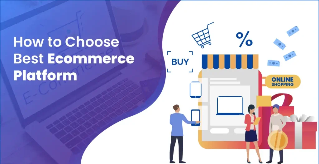
Introduction: Choosing the right ecommerce platform is the foundation of any successful online business. With so many options available, it’s easy to feel overwhelmed by features, pricing models, and technical jargon. Understanding how to choose the best ecommerce platform can help you avoid costly mistakes and set your store up for long-term growth. The ideal platform should match your business size, support your sales strategy, and offer room to scale. Your platform should reflect your design goals, support preferred payment methods, and meet the expectations of your target audience. A wrong choice can result in poor performance, limited integrations, and security concerns. On the other hand, the right platform streamlines operations and boosts conversions. In this guide, we’ll walk you through everything you need to know about how to choose the best ecommerce platform for your business goals in 2025. Why Your Ecommerce Platform Matters: Your ecommerce platform is more than just a tool—it’s the core of your online business. It affects how customers shop, how you manage operations, and how your brand grows. A powerful platform can drive sales and simplify workflows, while the wrong one can limit your potential. That’s why choosing wisely matters from day one. The platform you choose will influence: That’s why choosing the best ecommerce platform isn’t about going with the most popular option—it’s about finding the right fit for your business goals. Smart Tips for Ecommerce Platform Selection: Selecting the right ecommerce platform goes beyond looks and pricing. It requires a deep understanding of your business needs and long-term goals. From ease of use to scalability and integrations, every detail matters. Here are the key factors to help you make a confident, informed choice. Here are the core aspects you should evaluate before making a decision: 1. Business Model & Size: Start by identifying your business model: Also, consider your business size. A small business might not need the robust (and expensive) features an enterprise would. Platforms like Shopify or Wix are great for beginners, while Magento or BigCommerce might suit large enterprises better. 2. Ease of Use: If you don’t have a technical background, opt for a platform with an intuitive interface. Visual editors, ready-made themes, and an intuitive dashboard make launching your store quick and easy. Look for platforms that offer: 3. Design & Customization: Your website’s design can make or break a sale. A platform with a variety of customizable templates ensures your store looks professional and on-brand. Ask yourself: WooCommerce (on WordPress) offers extensive design flexibility for those with some web development experience, while Shopify balances design with ease. 4. Payment Options & Fees: Your ecommerce platform should support multiple payment gateways like: Check: Hidden transaction fees can add up quickly—BigCommerce stands out for having zero additional transaction fees. 5. Scalability: Choose a platform that grows with your business. While you may start small, your platform should be able to handle spikes in traffic, more product listings, and advanced features down the line. Look for: Platforms like Shopify Plus and Magento are designed for scaling efficiently. 6. SEO Capabilities: Search engine optimization is key to driving organic traffic. Without strong SEO tools, your store may not rank well on Google. Look for: WooCommerce and Shopify both offer strong SEO tools out of the box, plus integrations with SEO plugins. 7. Security Features: Online stores are prime targets for cyberattacks. Customers need to trust that their data is safe when they shop on your site. Make sure your platform offers: Shopify and BigCommerce offer built-in security and compliance to protect merchants and customers alike. 8. Integrations & Plugins: Your ecommerce platform should integrate smoothly with: The availability of integrations expands your capabilities without requiring custom development. WooCommerce offers thousands of plugins, while Shopify has a rich app store. 9. Customer Support: Issues will arise. A responsive and knowledgeable support team can be the difference between quick recovery and lost revenue. Check for: Shopify is known for excellent support, while platforms like Magento may require hiring a developer for technical issues. 10. Pricing & Total Cost of Ownership: Beyond the monthly fee, consider the total cost of running your store: Some options look budget-friendly at first, but hidden costs add up. Assess the complete financial picture before choosing. Conclusion: Choosing the right foundation for your online business is not a decision to take lightly. With so many platforms offering varied features, it’s essential to align your choice with your business goals, size, and technical needs. Understanding how to choose the best ecommerce platform means evaluating aspects like usability, design flexibility, payment options, scalability, and security. The right platform not only enhances the shopping experience but also simplifies your backend operations. It should grow with you, support your marketing strategies, and integrate with the tools you rely on. While no single platform is perfect for everyone, a thoughtful comparison will reveal the best fit. Consider total cost, customer support, and long-term potential when making your final call. Remember, your ecommerce platform is the engine behind your digital success. Make it a smart, strategic choice that empowers your business to thrive in 2025 and beyond. Also Read: How to Design Your Ecommerce Store
How to Plan Ecommerce Website

Introduction: The ecommerce industry is booming, and whether you’re launching a startup or expanding your brick-and-mortar store online, planning your ecommerce website the right way is essential for success. A well-structured ecommerce website doesn’t just look appealing—it enhances user experience, improves conversion rates, and supports business growth. In this detailed guide, we’ll walk you through how to plan an ecommerce website step-by-step to ensure your project launches smoothly and achieves long-term success. 1. Define Your Ecommerce Goals: Before diving into design or development, be clear about why you want an ecommerce website and what you hope to achieve. Ask yourself: Tip: Create SMART goals—Specific, Measurable, Achievable, Relevant, and Time-bound. For example, “Sell 500 units of our new product line within 6 months of launch.” 2. Research Your Target Audience: Knowing your audience is the foundation of a successful ecommerce strategy. Understand: Demographics: Age, gender, income level, location. Psychographics: Interests, values, buying behaviors. Challenges: What specific issues are your customers dealing with, and how can your product be the ideal solution? Use surveys, online forums, competitor research, and tools like Google Analytics or social listening to build accurate buyer personas. 3. Analyze the Competition: Studying your competitors gives you insight into what works and what doesn’t in your niche. Identify gaps in their offerings that you can fill to gain a competitive edge. 4. Choose the Right Ecommerce Platform: Your ecommerce platform is the backbone of your website. Popular options include: Shopify – User-friendly with built-in hosting. WooCommerce – Ideal for WordPress users. Magento – Highly customizable for large-scale operations. BigCommerce – Scalable and robust with good SEO features. When selecting a platform, consider: 5. Plan Your Website Structure: Design a clear site structure that guides visitors effortlessly through your online store for an intuitive browsing experience. Core Pages: Tip: Use wireframes or site maps to visualize how each page connects. A clean structure helps users and improves search engine indexing. 6. Organize Your Product Information: Well-structured product data improves user experience and drives sales. Key Elements: Use consistent formatting to make product comparison easy for shoppers. 7. Prioritize Mobile Responsiveness: Over 60% of ecommerce traffic comes from mobile devices. Your website must perform flawlessly across smartphones and tablets. Make sure your design is: Test mobile usability using tools like Google’s Mobile-Friendly Test or browser developer tools. 8. Streamline the Checkout Process: A complex checkout process leads to abandoned carts. Optimize for simplicity and speed. Best practices: Trust signals like secure checkout badges can also reduce friction. 9. Select Reliable Payment and Shipping Partners: You’ll need to integrate trusted payment gateways that your audience prefers, such as: For shipping, partner with providers offering fast, trackable, and affordable services. If possible, allow customers to choose their preferred delivery method and offer real-time tracking. 10. Plan for SEO and Marketing from Day One: An ecommerce site without traffic is like a store without footfall. Establish credibility by placing strong emphasis on securing customer data and transactions. SEO Planning: Marketing Essentials: 11. Design With UX and Branding in Mind: A beautiful, consistent design aligned with your brand can build trust and drive engagement. Key UX Features: Branding Considerations: Don’t overlook the power of design in influencing buying decisions. 12. Ensure Robust Security and Data Protection: Ecommerce sites deal with sensitive information. Establish credibility by placing strong emphasis on securing customer data and transactions. Display privacy policies clearly and explain how customer data will be used. 13. Set Up Analytics and KPIs: You can’t improve what you don’t measure. Set up tools to track performance: Track KPIs such as: Use these insights to continuously optimize your ecommerce store. 14. Test Before Launching: Run thorough QA (Quality Assurance) checks before going live. Conduct a soft launch or beta test with select users to collect feedback. 15. Prepare for Post-Launch Operations: Launching your site is just the beginning—the ongoing effort is what drives real growth and success. Have systems in place for: Automate wherever possible to save time and maintain consistency. Conclusion: Planning an ecommerce website isn’t just about choosing a theme and uploading products—it’s about crafting a seamless, conversion-focused experience that attracts and retains customers. By following the above steps—from defining goals and choosing the right platform to optimizing UX and launching with confidence—you’ll set yourself up for sustainable growth in a competitive online marketplace. Whether you’re DIY-ing or working with a development agency, thoughtful planning is the most valuable investment you can make in your ecommerce journey. Also Read: How to Choose best Ecommerce Platform
Powerful Lead Generation System
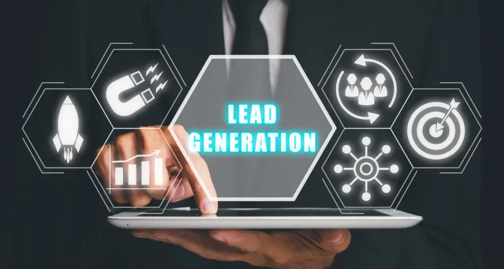
Introduction: In today’s competitive digital landscape, businesses need more than just traffic—they need a Powerful Lead Generation System to convert interest into revenue. This system is the backbone of sustainable growth, enabling brands to consistently attract, capture, and nurture potential customers. Unlike outdated tactics, a powerful lead generation system leverages data, automation, and personalized content to drive results. It connects your marketing efforts with sales outcomes, ensuring that no opportunity is wasted. Whether you’re a startup or an enterprise, building a system that works around the clock is essential. From landing pages to email workflows, every component must serve a purpose. With the right strategy, a Powerful Lead Generation System becomes your most valuable business asset. What Is a Lead Generation System? A Lead Generation System is a strategic combination of tools, content, platforms, and processes designed to attract prospects, capture their information, and guide them through the sales funnel until they’re ready to convert. This system doesn’t rely on guesswork. It’s data-driven, automated where necessary, and optimized for performance. It includes both inbound and outbound tactics—ranging from SEO, content marketing, email sequences, landing pages, paid ads, CRM integrations, and more. Why Most Businesses Fail at Lead Generation: Before building a successful system, it’s important to understand what not to do. Many businesses struggle because they: A powerful lead generation system avoids these pitfalls by prioritizing relevance, timing, and trust-building. Core Components of a Powerful Lead Generation System: 1. Customer Avatar & Buyer Journey Mapping: Before writing a single headline or building a funnel, you need to know exactly who you’re targeting. Create detailed customer personas that outline: Then, map their journey—from awareness to interest to decision—to design tailored touchpoints at each stage. 2. Lead Magnet Creation: Your prospects won’t give up their contact information without a compelling reason. That’s where lead magnets come in. These are free, high-value resources offered in exchange for email addresses or phone numbers. Examples include: Ensure your lead magnet addresses a genuine need and directly supports the main product or service you provide. 3. Landing Page Optimization: A powerful lead generation system uses dedicated landing pages that are laser-focused on conversion. These pages should include: Avoid distractions—remove navigation bars or external links—and make sure the page is mobile-optimized. 4. Traffic Generation Strategy: Once your landing page and lead magnet are ready, it’s time to drive targeted traffic. Incorporate both organic strategies and paid campaigns to bring targeted visitors to your page: Organic Channels: Paid Channels: Focus on intent-driven targeting—people who are actively looking for solutions you offer. 5. Lead Capture and CRM Integration: When a user submits their contact info, it should be automatically routed to a Customer Relationship Management (CRM) tool like HubSpot, Zoho, or Salesforce. Benefits of using a CRM in your system: Without CRM integration, leads can get lost or go cold due to slow responses. 6. Email Nurturing Sequence: Leads often need time before making a decision, making an engaging and targeted email nurturing flow vital. An effective sequence includes: Welcome Email – Your first email should say hello and include a direct link to the lead magnet to meet expectations. Value Emails – Share actionable tips, case studies, or industry insights Problem/Solution Emails – Address specific pain points your offer solves Social Proof Emails – Share reviews or testimonials Sales Email – Present your offer with urgency or bonuses Use segmentation and personalization to keep engagement high and build trust. 7. Retargeting Campaigns: When visitors don’t convert on their first visit, retargeting helps bring them back with timely and relevant messaging. You can use Facebook Pixel or Google Tag Manager to track user behavior and show tailored ads to warm leads. Examples: Re-engaging past visitors through retargeting enhances brand visibility and accelerates conversion performance. 8. Lead Scoring and Qualification: Not all leads are equal. Some leads are primed to purchase, while the rest benefit from ongoing communication and value-driven follow-up. Implement a lead scoring system based on: This approach ensures your top leads get immediate attention, while others are gradually developed through automation. 9. Sales Integration & Follow-Up: Once leads are qualified, they should be handed off to your sales team or appointment system. Personal contact—via call, Zoom, or chat—can help close the deal. Ensure your system includes: Timely responses can make all the difference when it comes to converting interested leads. 10. Analytics and Optimization: A powerful system is never static. Constantly monitor performance metrics like: Use A/B testing for subject lines, ad creatives, CTA buttons, and landing page layouts. The goal is continuous improvement and system scaling. Bonus: Tools to Power Your Lead Generation System: Here are some essential tools to supercharge your lead gen efforts: Landing Pages: Unbounce, Leadpages, Instapage Email Marketing: Mailchimp, ConvertKit, ActiveCampaign CRM & Automation: HubSpot, Zoho CRM, Pipedrive Analytics: Google Analytics, Hotjar, Facebook Pixel Design: Canva, Figma, Adobe Express Webinars: Zoom, Demio, WebinarJam Choose tools based on your budget, team size, and workflow. Conclusion: A Powerful Lead Generation System goes beyond campaigns; it’s a strategic pillar for sustained business performance. By aligning content, technology, and customer insights, it turns prospects into loyal customers. Every lead captured through this system represents a step toward increa sed revenue and stronger brand trust. As markets evolve, businesses that invest in smart lead generation will stay ahead of the curve. The key lies in continuous testing, refining, and adapting your approach. Don’t leave growth to chance—build a system that works even when you’re not. With a Powerful Lead Generation System, success becomes not just possible, but predictable. Also Read: How to Plan Ecommerce Website
Improve Customer Retention Strategy
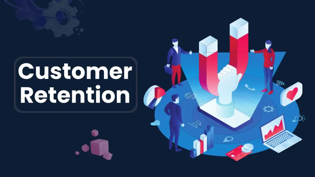
Introduction: In today’s competitive market, businesses must do more than just attract new customers—they must work hard to keep them. A well-planned approach to improve customer retention strategy can significantly boost long-term revenue and brand loyalty. Loyal customers not only spend more but also refer others, acting as brand ambassadors. While acquiring new customers can be expensive, focusing on retention typically delivers a greater return for your investment. Companies that prioritize retention create stronger customer relationships and gain a competitive edge. By understanding customer needs and delivering consistent value, you can reduce churn and increase satisfaction. This guide explores powerful ways to improve your customer retention strategy and grow sustainably. Why Customer Retention Matters: Before diving into strategies, let’s look at why retention should be a priority: Cost Efficiency: It’s 5–7 times more expensive to acquire a new customer than to retain an existing one. Loyal Customers Spend More: Existing customers are 50% more likely to try new products and spend 31% more than new customers. Brand Advocacy: Loyal customers become brand ambassadors, driving word-of-mouth marketing. Improved ROI: A 5% increase in customer retention can increase profits by 25% to 95% (Bain & Company). Clearly, customer retention isn’t just a tactic—it’s a growth strategy. 1. Personalize the Customer Experience: Today’s customers demand more than standard service—they seek personalized experiences that reflect their individual needs and interests. Use Data Wisely: Leverage customer data to send personalized emails, product recommendations, or loyalty perks. Segmentation: Divide your audience by behavior, purchase history, and demographics to tailor communication effectively. AI & Automation: Use intelligent tools to deliver personalization at scale—like chatbots with memory, dynamic emails, or tailored offers. Example: Netflix uses viewing data to recommend shows users are most likely to enjoy, increasing engagement and retention. 2. Prioritize Excellent Customer Support: Support can make or break the customer journey. Poor service is one of the top reasons customers churn. Omnichannel Support: Be available across platforms—email, chat, phone, social media—with consistent service. Faster Resolution Times: Implement AI-powered routing and self-service options like FAQs or chatbots. Human Touch: Even with automation, make sure human agents are accessible and empowered to solve complex problems. Tip: Track response time, resolution rate, and customer satisfaction (CSAT) to continuously improve your support quality. 3. Build a Customer Feedback Loop: Your customers are your best consultants. Listening to them builds trust and helps improve your offerings. Collect Feedback: Use surveys, NPS (Net Promoter Score), and social listening tools. Act on Feedback: Show customers that their opinions drive real changes. Close the Loop: Follow up with customers who leave feedback to show appreciation and share updates. Example: Slack regularly incorporates user feedback into product updates, creating a sense of community and inclusion. 4. Offer Loyalty and Rewards Programs: Reward programs encourage customers to return and help strengthen their emotional connection with your brand. Points-Based Programs: In points-based systems, shoppers accumulate rewards with each purchase, which they can later exchange for discounts or exclusive perks. Tiered Rewards: Offer more benefits as customers climb loyalty levels—encouraging more spending. Exclusive Access: Provide early access to sales or products as a reward. Pro Tip: Keep it simple and transparent. Complicated systems discourage participation. 5. Improve Onboarding for New Customers: Initial customer interactions shape the long-term relationship, and an effective onboarding experience can significantly lower churn rates. Educational Content: Share helpful resources like tutorials, introductory emails, and step-by-step guides to educate and support new customers. Check-in Support: Follow up after the first purchase or sign-up to offer help. Milestone Acknowledgment: Celebrate their first order, subscription anniversary, or usage milestones. Example: Duolingo uses gamified onboarding with progress tracking and gentle nudges to keep new users engaged. 6. Monitor and Reduce Churn: Churn is inevitable—but you can minimize it with proactive measures. Identify At-Risk Customers: Use analytics to flag those showing signs of disengagement. Win-Back Campaigns: Reconnect with inactive customers using targeted emails or offers. Exit Surveys: Understand why customers leave and refine your approach accordingly. Pro Tip: Analyze patterns across churned customers to fix root causes, not just symptoms. 7. Stay Consistent with Brand Communication: Your tone, message, and visuals should feel cohesive across every touchpoint. Brand Voice: Whether casual or professional, your communication style should match your brand identity. Email Marketing: Send timely, relevant emails—not just sales pitches. Think value-first. Content Marketing: Educate, entertain, and inform your audience consistently to remain top-of-mind. Bonus: Use storytelling to emotionally connect with your audience. People remember stories far more than facts. 8. Offer Real Value Beyond the Product: Customers stick with brands that enrich their lives beyond just selling. Educational Content: Share blogs, tutorials, webinars, or industry insights. Community Building: Create online forums or social groups where customers can interact. Customer Appreciation Events: Host webinars, giveaways, or exclusive sessions to show you care. Example: Lululemon hosts free yoga classes to foster community and brand engagement. 9. Use Predictive Analytics: With the right technology, businesses can anticipate customer actions and strategically adapt their approach in advance. Predict Buying Cycles: Send timely offers when a customer is likely to reorder. Identify Trends: Use machine learning to analyze preferences and usage patterns. Personalized Retargeting: Serve ads based on a customer’s unique journey, not generic templates. Pro Tip: Invest in tools like Customer Data Platforms (CDPs) for centralized insights. 10. Make Customer Success a Company-Wide Goal: Retention shouldn’t fall solely on your customer service team. It should be part of your entire business strategy. Cross-Department Collaboration: Sales, marketing, support, and product teams should align on retention metrics. Set KPIs: Track metrics like CLV (Customer Lifetime Value), churn rate, NPS, and retention rate. Reward Loyalty: Recognize and celebrate long-term customers internally and externally. Example: Zappos trains all employees to prioritize customer happiness—not just the support team. Conclusion: To thrive in today’s competitive landscape, businesses must look beyond one-time transactions and focus on lasting relationships. A strong effort to improve customer retention strategy ensures better customer satisfaction, increased lifetime value, and sustainable growth. Loyal customers are more likely to return, refer others, and engage with
Customer Handling Made Smarter

Introduction: In today’s customer-driven world, simply offering quality products or services isn’t enough—how you manage customer interactions plays a critical role in your success. Customer Handling Made Smarter is about upgrading your approach to meet modern expectations with speed, personalization, and empathy. As technology reshapes the business landscape, smarter handling involves integrating tools like CRM systems, AI chatbots, and data analytics. These innovations allow companies to respond faster, resolve issues more efficiently, and create lasting customer relationships. Gone are the days of scripted responses and long wait times—today’s customers want real-time solutions and meaningful engagement. By focusing on proactive service and seamless communication across channels, businesses can exceed expectations. Customer Handling Made Smarter is not just a trend—it’s the future of sustainable, customer-centric growth. 1. Understanding What Modern Customers Really Want: Today’s customers are highly aware, digitally engaged, and more discerning in their choices than ever before.They seek not just products, but meaningful experiences that align with their values and expectations. Understanding what modern customers really want is the key to delivering service that resonates and builds lasting loyalty. Today’s customers want: Personalization: Tailored experiences based on their preferences. Speed: Quick resolutions and fast responses. Transparency: Clear, honest communication. Empathy: A human touch even in automated interactions. Understanding these expectations is the first step to smarter customer handling. 2. Invest in a Smart CRM System: A Customer Relationship Management (CRM) system is no longer optional—it’s essential. Smart CRMs like HubSpot, Salesforce, or Zoho gather and organize customer data to give your team a 360-degree view of every interaction. Benefits include: Automated tracking of past communications. Customer segmentation for personalized outreach. Workflow automation for faster ticket resolutions. Analytics dashboards to monitor service performance. A well-implemented CRM enables you to proactively understand and address customer needs—even before they’re expressed. 3. Train Smarter, Not Harder: Effective customer service starts with a well-prepared team, but traditional training methods often fall short. To meet evolving customer expectations, businesses must focus on smarter, more adaptive training strategies. “Train Smarter, Not Harder” emphasizes quality over quantity—empowering staff with the right tools, knowledge, and mindset for exceptional service. Equip them with more than scripts and FAQs—invest in smarter training: Emotional intelligence workshops: Help your team handle stressful or emotional conversations with empathy. Scenario-based learning: Scenario-based learning uses practical simulations to equip agents with the skills to handle real-world customer challenges confidently. Knowledge base access: Empower them with tools to find quick solutions instead of escalating issues. A smarter workforce leads to smarter customer handling. 4. Use AI and Chatbots Wisely: Artificial Intelligence and chatbots have revolutionized customer service, but only when used thoughtfully. They should enhance—not replace—the human experience by handling routine tasks and enabling faster support. Using AI and chatbots wisely means balancing automation with empathy to deliver seamless, efficient, and personalized interactions. When used correctly, they don’t replace humans—they enhance them. For example, a chatbot might handle order tracking and refunds while passing more nuanced complaints to a live agent. 5. Omnichannel Support: Be Everywhere Your Customers Are: Smarter customer handling means offering seamless support across channels: Social media: Monitor mentions and respond quickly to complaints. Live chat: Provide instant help while customers browse your site. Email support: Automate replies and prioritize based on urgency. Phone: Make IVR systems more user-friendly and connect customers to the right person, not a maze of options. Use unified platforms like Freshdesk or Zendesk to manage all these channels from a single dashboard. 6. Feedback Loops: Learn and Improve Continuously: Handling customers smartly involves listening—and acting on what you hear. Feed this data back into your processes to refine your service model. 7. Smarter Escalation Protocols: Not every customer issue can be resolved at the first level, making an efficient escalation process essential. Intelligent escalation processes make sure complex issues are promptly handled by the right experts, minimizing delays and customer frustration. By streamlining this flow, businesses can boost resolution speed, maintain trust, and enhance overall customer satisfaction. To handle this better: Implement clear escalation paths: Ensure agents know when and how to escalate. Tag high-priority customers: VIPs should receive immediate attention. Track issue resolution timelines: Ensure escalated cases don’t fall through the cracks. The faster and smoother the resolution, the more trust you earn. 8. Leverage Customer Data for Personalization: Customers don’t want to feel like a ticket number—they want to feel recognized. Personalized handling makes customers feel valued and encourages long-term engagement. 9. Empower Customers with Self-Service: Today’s customers value speed, convenience, and control in how they solve problems. Empowering them with self-service options like FAQs, tutorials, and AI-driven help centers meets these expectations. When done right, self-service not only boosts customer satisfaction but also reduces the burden on support teams. Create and promote: FAQ sections How-to videos Interactive tutorials AI-driven help centers that suggest articles based on query input According to a Zendesk report, 69% of customers want to solve issues on their own. Give them the tools to do so. 10. Measure What Matters: Smarter handling isn’t just about better tools—it’s about better metrics. Track key performance indicators (KPIs) such as: Monitor trends, spot issues early, and continually optimize. 11. Culture of Customer-Centricity: Ultimately, smart handling comes from within. It’s a mindset—one that places the customer at the heart of your operations. Brands like Zappos and Amazon have built empires on this foundation. Conclusion : In today’s competitive market, businesses can no longer afford to treat customer service as an afterthought. Customer Handling Made Smarter is not just about technology—it’s about understanding, empathy, and proactive engagement. By integrating tools like CRMs, AI chatbots, and omnichannel support, companies can respond faster and more effectively. Smart handling also involves training teams to deliver consistent, personalized experiences. Empowering customers with self-service options adds another layer of convenience. Ultimately, Customer Handling Made Smarter leads to stronger relationships, increased loyalty, and long-term business success. Also Read: Improve Customer Retention Strategy
Personalized Customer Experience Tools

Introduction: In the modern digital age, personalized experiences have shifted from being optional to absolutely essential. Customers expect businesses to understand their preferences, anticipate their needs, and deliver seamless, tailored experiences at every interaction. This shift has led to the rise of personalized customer experience (CX) tools—powerful technologies designed to help brands connect with users on a deeper level. From AI-driven recommendations to behavior-based automation, these tools are revolutionizing how businesses build loyalty and drive growth. In this blog post, we’ll explore the top personalized customer experience tools, how they work, and how they can be strategically implemented across industries. Why Personalization Matters in Customer Experience: Research from Epsilon reveals that 8 out of 10 shoppers are more inclined to buy when they receive personalized brand interactions. Whether it’s through personalized email marketing, website content, or customer support, consumers now expect interactions to reflect their individual needs and preferences. Benefits of personalization include: To meet these expectations, businesses are turning to advanced tools designed specifically to deliver meaningful, one-on-one experiences at scale. Categories of Personalized Customer Experience Tools: There is a wide range of tools available that cater to different stages of the customer journey. Below are the major categories: 1. Customer Relationship Management (CRM) Systems: Modern CRMs go beyond contact storage—they gather, analyze, and utilize customer data to personalize interactions across touchpoints. Popular Tools: Use Case: A sales team receives alerts when a customer views a pricing page, enabling personalized follow-up based on behavior. 2. AI and Machine Learning Platforms: AI-powered platforms analyze huge volumes of customer data in real-time to deliver hyper-personalized recommendations and messaging. Popular Tools: Use Case: An e-commerce site suggests products based on browsing history, past purchases, and real-time behavior. 3. Marketing Automation Platforms: These tools automate personalized messaging across email, SMS, social media, and more—based on specific customer actions or lifecycle stages. Popular Tools: Use Case: A user who abandons a cart receives a customized email reminder featuring similar products and a time-sensitive discount. 4. Customer Data Platforms (CDPs): Customer Data Platforms (CDPs) bring together data from various sources to build comprehensive customer profiles, which drive personalized marketing and sales efforts. Popular Tools: Use Case: A retailer creates micro-segments like “frequent weekend buyers” to tailor weekend-exclusive promotions. 5. Personalization Engines: These are specialized tools that dynamically customize website content, banners, CTAs, and product displays based on visitor data. Popular Tools: Use Case: A first-time visitor sees an educational blog post, while a repeat customer is shown a product upgrade offer. 6. Conversational AI and Chatbots: AI chatbots provide real-time, intelligent support while personalizing responses based on user data and past interactions. Popular Tools: Use Case: A returning customer chats with a bot that recalls their past issues and offers faster, more relevant support. Key Features to Look For: When evaluating personalized CX tools, consider the following must-have features: Real-time data processing – For up-to-the-second personalization. Integration capabilities – Ability to connect with your CRM, CMS, e-commerce, and analytics tools. Behavioral tracking – Monitor user actions across channels. Segmentation and targeting – Create precise audience groups based on behavior or profile attributes. AI and predictive analytics – Artificial intelligence and predictive models empower companies to identify customer intent and fine-tune personalization efforts. Cross-channel consistency – Ensure uniform messaging on web, mobile, email, and support. Challenges in Implementing Personalization: While the benefits are clear, implementing personalized experiences does come with challenges: Data Silos: Many companies store data in disconnected systems, making true personalization difficult. Privacy Concerns: Excessive personalization can trigger privacy concerns, so brands must balance customization with clear data policies and legal compliance. Scalability: Personalized campaigns can be complex to scale without the right tools and workflows. Content Requirements: More personalization requires more content variations, increasing workload for creative teams. Solution: Leverage AI tools that automate much of the personalization process, and invest in unified platforms like CDPs and integrated CRMs. Real-World Example: How Netflix Nails Personalization: Netflix is a textbook example of personalized CX. Using machine learning algorithms, Netflix tailors: Best Practices for Using Personalization Tools: To maximize the impact of these tools: Start with data hygiene – Clean, organized data leads to better personalization outcomes. Define clear segments – Use demographics, behavior, and interests to group users. Personalize beyond first names – Go deeper with behavior, intent, and timing. Measure and refine – Track KPIs like click-through rates, conversions, and customer satisfaction. Maintain privacy and trust – Be transparent about data use and always offer opt-out options. Future Trends in Personalized Customer Experience: Predictive Personalization – This approach uses artificial intelligence to forecast individual preferences, allowing for preemptive personalization. Voice & Visual Personalization – Tailoring experiences via voice assistants and image recognition. Hyper-Personalization – Combining real-time data, location, and behavior to deliver unique individual experiences. Personalization-as-a-Service (PaaS) – With PaaS, companies gain access to modular cloud services that enable instant, personalized interactions across digital channels. Conclusion: In an era where customers crave relevance, personalized customer experience tools are the secret weapon for brands aiming to build meaningful, lasting relationships. Whether you’re a startup or an enterprise, investing in the right tools can significantly enhance customer engagement, satisfaction, and retention. As competition intensifies and customer expectations rise, personalization isn’t just a trend—it’s the new standard. Equip your business with the right technology, and you’ll not only meet expectations—you’ll exceed them. Also Read: Customer Handling Made Smarter