Making Simple Selections Easily

Introduction: Making precise selections is one of the most essential skills in photo editing and graphic design. Whether you’re isolating a subject, changing a background, or applying effects, clean selections set the foundation. Thankfully, modern tools like Photoshop make this process much easier—even for beginners. From basic shapes to complex edges, there’s a tool for every type of selection. Selecting the appropriate tool for each task boosts efficiency and enhances the overall quality of your edits. In this guide, we’ll explore simple and effective methods for making selections with ease. No stress, no guesswork—just smart, clean editing. Why Selections Matter: Before diving into the techniques, let’s quickly understand why making selections is such an important skill. Selections allow you to: Mastering selections will dramatically improve your efficiency and precision when editing. 1. The Marquee Tools – Perfect for Basic Shapes: The Marquee Tools are the most straightforward way to make selections. These are ideal for selecting rectangular or elliptical areas. How to Use: Best For: It’s simple, fast, and perfect for images that have clearly defined geometric areas. 2. The Lasso Tools – Freeform Flexibility: When your selection doesn’t follow a standard shape, tools like the Lasso, Polygonal Lasso, and Magnetic Lasso offer flexible solutions. Regular Lasso: Magnetic Lasso: Quick Tip: 3. The Quick Selection Tool – Smart and Intuitive: The Quick Selection Tool (W) is a favorite among beginners and pros alike. It intelligently detects edges based on color and texture similarity. How to Use: Why It’s Great: For fast results with minimum effort, this tool is hard to beat. 4. Magic Wand Tool – One Click Wonders: When dealing with uniform color regions, the Magic Wand Tool proves highly effective for quick and easy selections. How It Works: Pro Tip: Lower tolerance for precise areas; higher tolerance for broader ranges. Perfect for selecting skies, solid backgrounds, or monochrome items. 5. Select Subject – Powered by Adobe Sensei: Recent versions of Photoshop feature an AI-driven tool called Select Subject. It automatically identifies the main subject in your image. How to Use: It’s incredibly helpful for portraits, products, or any image with a clear focal point. 6. Select and Mask: Refine Selections Precisely: Once you’ve made a selection, chances are it needs a bit of tweaking. That’s where Select and Mask comes in. How to Use: Best Practices: This panel is essential when working with hair, fur, or semi-transparent objects like veils or smoke. 7. Color Range – Targeting Specific Tones: If you’re working with images that have vibrant and contrasting colors, Color Range can be your best friend. Steps: This technique is useful for isolating colored backgrounds, replacing skies, or emphasizing a specific color theme. 8. Tips for Easier Selections: Even with powerful tools, good technique can make or break your selection process. Here are some golden rules: Zoom In and Out: Don’t rely on the default view. Zoom Closer for Precision, Zoom Out to Check the Bigger Picture Use Layer Copies: Always work on a duplicate layer when experimenting. That way, your original image stays untouched. Combine Tools: Don’t hesitate to use multiple tools in a single workflow. For example, use Quick Selection first, then refine with Lasso or Select and Mask. Use Add/Subtract Modes: Hold Shift to add to a selection, and Alt (Option) to subtract. This keeps your work flexible and non-destructive. 9. Practice Projects to Improve Selection Skills: To truly master selections, practice with real images. Here are a few beginner-friendly projects: Cut Out a Subject: Remove the background from a portrait. Change Background Color: Quickly modify background colors by using the Magic Wand tool alongside fill layers. Color Pop Effect: Select one object and desaturate everything else. Text Clipping Mask: Select a part of an image to fit inside text shapes. Hands-on experience will build confidence and sharpen your accuracy. 10. Common Mistakes to Avoid: Beginners often fall into these traps when making selections: Over-Feathering: Applying too much feathering results in overly soft edges and diminished detail. Ignoring Refinement: A rough selection may look acceptable on a small scale but falls apart on larger screens or prints. Not Zooming In: Precision is key, especially around curves and hair. Relying on One Tool: Each tool has strengths. Combining them gives you far better control. Conclusion: Making simple selections doesn’t have to be overwhelming. With a solid grasp of Photoshop’s selection tools and some regular practice, anyone can isolate, cut out, or modify image areas quickly and efficiently. Whether you’re a digital artist, photographer, or content creator, learning how to make clean, controlled selections will supercharge your creative projects. Also Read: Using Masks and Adjustments
Basic Photo Editing Techniques
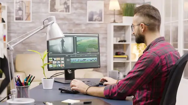
Introduction: In the digital world of today, visuals are everything. Whether you’re designing a marketing banner, social media post, website layout, or product packaging, high-quality edited images are essential to creating professional and impactful designs. As a graphic designer, knowing how to apply basic photo editing techniques gives you the creative control to bring ideas to life. This blog post explores the most important and widely used basic photo editing techniques every aspiring graphic designer must master. No matter what software you use — Adobe Photoshop, Lightroom, GIMP, or Canva — these techniques form the foundation of digital design. 1. Cropping and Straightening: One of the most basic, yet powerful tools in any photo editing software is the Crop Tool. Cropping allows you to: Pair this with straightening, and you can correct tilted images — particularly useful for architecture, horizon shots, or product photos that should appear perfectly aligned. Pro Tip: Use the Rule of Thirds grid while cropping to achieve better visual balance. 2. Adjusting Brightness and Contrast: Brightness affects the overall lightness or darkness of an image, while contrast determines the difference between the lightest and darkest areas. Fine-tuning these settings helps to ensure that your images look clean, vivid, and professionally lit. Avoid extremes to prevent losing details. 3. Color Correction and White Balance: Correct color tones are critical in design. Often, raw images may appear too cool (blue) or too warm (yellow). This is where white balance correction comes into play. Use tools like: These help to: 4. Saturation and Vibrance Control: Saturation adjusts the intensity of all colors in an image. Over-saturation can make photos look artificial, while under-saturation makes them dull. Vibrance is a more selective tool — it increases the intensity of less-saturated colors without overdoing already bright areas. It’s ideal for portraits or lifestyle images. Graphic design tip: Use vibrance for subtle improvement; saturation when you want to make colors pop boldly. 5. Sharpening and Clarity: Images often lose sharpness when resized or compressed for web. Adding sharpening can restore detail and make textures more prominent. Caution: Over-sharpening can cause unwanted noise or halo effects. Apply it selectively. 6. Removing Blemishes or Unwanted Objects: Whether it’s a skin blemish, dust particle, or background distraction, removing imperfections is essential. Use: This technique is particularly useful in product photos, real estate images, and portraits. Clean backgrounds and surfaces make your design look polished. 7. Using Filters and Presets: Filters and presets provide a quick and consistent way to stylize photos. In software like Lightroom or Canva: While they’re great time-savers, it’s important to adjust them based on your image’s specific lighting and tones. Avoid using default filters without tweaks. 8. Resizing and Resolution Settings: Grasping image resolution is essential when optimizing visuals for various platforms and display formats. Graphic designers should always ensure that images look crisp across all screen sizes and mediums. 9. Layer-Based Editing: For non-destructive editing, especially in Photoshop or Affinity Photo, use layers: This gives you flexibility to revise, hide, or tweak changes without starting over — a must for professional design work. 10. Blurring and Depth of Field: Adding a subtle background blur can help your subject stand out, especially in promotional or portfolio images. Use tools like: You can simulate depth of field effects often seen in DSLR photography. This gives your image a more cinematic or premium look. 11. Text Overlay and Typography: For social media or advertisement graphics, adding text is often necessary. Ensure your typography: Keep contrast in mind — light text over dark backgrounds, or vice versa. Use shadows or outlines for added visibility. Design Hack: Apply slight blur or gradient under the text area for better readability without damaging the original photo. 12. Saving in the Right Format: Finally, knowing which format to save your edited photo in is important: JPEG – JPEG is ideal for everyday use, offering a balance between image quality and compact file size.PNG – For images with transparency.TIFF – High-quality format for printing.PSD – Editable Photoshop file with layers intact. Always keep a master copy before flattening or compressing your work. Conclusion: Mastering these basic photo editing techniques is the first step in your journey as a graphic designer. Clean, well-edited photos enhance your overall design quality, improve client satisfaction, and establish a professional brand image. Don’t rush the process. With practice and a keen eye for detail, even simple adjustments can transform a plain photo into a stunning visual element in your design project. Also Read: Making Simple Selections Easily
Working with Layers Basics

Introduction: Graphic design is a fusion of creativity and structure. Whether you’re designing a poster, editing a photo, or crafting a logo, understanding how to working with layers basics is fundamental to your success. Layers are the backbone of most modern graphic design software, offering a non-destructive and highly organized approach to creating complex visuals. In this blog post, we’ll explore the basics of layers in graphic design: what they are, why they matter, and how to work with them efficiently. Whether you’re using Adobe Photoshop, Illustrator, GIMP, or any other design tool, these concepts remain consistent and critical. What Are Layers? Think of layers as transparent sheets stacked on top of each other. Each layer contains individual elements of your design—text, images, shapes, or effects—that you can manipulate independently without affecting the rest of the composition. Layers allow you to: For instance, in a simple poster design, you might have separate layers for: Without layers, all these elements would be stuck together on one canvas, making edits extremely difficult. Types of Layers: Depending on the software you’re using, there are different types of layers you might encounter: Raster Layers: These are pixel-based layers used in software like Photoshop. You can paint, erase, or apply filters on them. Raster layers are great for photo editing and digital painting. Vector Layers: Used in tools like Adobe Illustrator, vector layers are resolution-independent, meaning they can be scaled without losing quality. They’re perfect for logos, icons, and typography. Adjustment Layers: These layers apply effects (like brightness, contrast, hue, saturation) without altering the original image. You can adjust or delete them anytime, preserving the original content. Text Layers: These contain editable text. You can change the font, size, color, and effects without converting the text into pixels or outlines. Shape Layers: Shape layers hold geometric forms created using the shape tools. They can be filled with color, patterns, or gradients and remain editable. Why Layers Are Important in Design: 1. Organized Workflow: Layers keep your design clean and structured. You can name them, group them, and reorder them for clarity, especially on complex projects. 2. Non-Destructive Editing: With layers, you don’t have to worry about damaging your original image or elements. You can edit and experiment freely. 3. Easier Revisions: Clients often request changes. Layers make it simple to tweak just one part of the design without redoing the entire thing. 4. Flexible Design Process: You can hide, lock, or duplicate layers to test variations or isolate certain design elements. Layer Panel Basics: The Layers panel acts as your command hub for organizing and controlling every element in your design. Though each design software has a slightly different layout, most panels allow you to: Mastering the Layer Panel helps speed up your workflow and avoid mistakes. Layer Hierarchy and Stacking Order: Layers are arranged in a vertical order, where elements placed higher in the stack visually appear above those positioned beneath them. For example: Understanding stacking order is essential when creating depth or placing elements strategically in a layout. Blending Modes: Blending modes determine the visual interaction between a layer and those lying underneath it. These are especially useful for creating lighting effects, textures, and color adjustments. Common blending modes include: Layer Masks: Using layer masks, you can control which parts of a layer are visible or hidden without changing the original image. Black conceals, white reveals—allowing for detailed, non-permanent adjustments to your design. Why use masks? Layer masks are essential for compositing images or creating soft transitions. Adjustment Layers: Adjustment layers sit on top of your existing layers and apply image-wide edits. Common adjustments include: Because they’re separate from the image itself, you can turn them off, change them, or move them around freely. Layer Styles and Effects: Layer styles add visual enhancements like: These are accessible via a double-click on the layer (in Photoshop) or through dedicated menus in other programs. They update in real time and are fully editable. Naming and Grouping Layers: As your design grows, managing layers becomes critical. Use these best practices: Name Your Layers: Avoid default names like “Layer 1” or “Copy 2.” Use descriptive names like “Header Text” or “Logo Icon.” Group Related Layers: Combine related layers into folders or groups (e.g., all text elements, background assets). This helps you collapse and expand groups to navigate your project faster. Color Code Layers (if available): In some software, like Photoshop, you can assign color labels to layers for visual organization. Tips for Efficient Layer Use: Use Shortcuts: Learn keyboard shortcuts for creating, duplicating, locking, and selecting layers. Don’t Flatten Unless Necessary: Keep layers intact for flexibility. Flattening is permanent. Use Smart Objects for Reuse: Convert elements into Smart Objects when reusing graphics across multiple layers or projects. Keep a Clean File: Delete unused or hidden layers before final delivery. It reduces file size and keeps your design clean. Back Up Your File: Save versions or duplicates in case you need to revert to a previous state. Conclusion: Mastering layers is a core skill for every graphic designer. They give you creative control, flexibility, and organization, allowing your design process to be smoother and more professional. Whether you’re just starting out or building a long-term career in design, understanding how to work with layers will save you time, reduce mistakes, and improve the quality of your final work. As you continue your journey in graphic design, challenge yourself to explore deeper aspects of layer use—like advanced masking, smart objects, and dynamic effects. Layers aren’t just a feature—they’re the framework that supports your creativity. Also Read: Basic Photo Editing Techniques
Photoshop Interface and Tools
Introduction: Adobe Photoshop is widely recognized as the premier software choice in the graphic design industry. Whether you’re editing photos, creating digital artwork, or designing web assets, Photoshop offers an extensive toolkit that empowers creativity. At the heart of this powerful software lies its interface and tools — the foundation upon which every graphic designer builds their projects. In this comprehensive guide, we’ll explore the Photoshop interface and the essential tools every graphic designer should know. Whether you’re a beginner or looking to sharpen your skills, understanding the layout and function of Photoshop’s core tools can significantly enhance your workflow and creative output. 1. Understanding the Photoshop Interface: It’s essential to get acquainted with Photoshop’s interface before exploring its vast array of tools. Adobe has crafted an intuitive workspace that balances customization with functionality. The Menu Bar: Positioned at the top of the screen, the Menu Bar features sections such as File, Edit, Image, Layer, Select, Filter, View, Window, and Help—each housing a collection of relevant tools and functions. The Options Bar: Situated beneath the menu bar, the Options Bar dynamically updates based on the currently selected tool, presenting settings such as size, opacity, alignment, and style tailored to that specific tool. The Tools Panel: This vertical bar on the left side of the screen holds all your tools — from selection and painting to text and navigation. Understanding each tool’s function is key to mastering Photoshop. The Document Window: This is your actual canvas — where you create and edit images. Multiple documents can be opened simultaneously in separate tabs. Panels and Palettes: To the right of the interface, you’ll find collapsible panels such as Layers, Adjustments, Properties, Color, Swatches, and more. These panels help you manage layers, modify elements, and apply effects. 2. Essential Photoshop Tools for Graphic Designers: Now let’s explore the core Photoshop tools that are crucial for any graphic design project. 1) Selection Tools: Selection tools allow designers to isolate parts of an image or design for editing. 2) Crop and Slice Tools: These tools help trim or divide images efficiently. 3) Retouching and Healing Tools: Used to enhance or correct images by removing flaws. 4) Painting Tools: Used for digital painting and color application. 5) Drawing and Shape Tools: Crucial for vector-based design and layout. 6) Type Tools: Text is an essential element in most graphic designs. 7) Navigation Tools: These help you zoom and move around your canvas. 3. Layers and Layer Management: Layers are the backbone of non-destructive editing in Photoshop. Every new element, whether it’s text, shape, or brush stroke, can exist on its own layer. Types of Layers: Layer Features: Effective layer management — using groups, naming conventions, and color coding — is vital for large or complex projects. 4. Advanced Features for Designers: While the basics cover most needs, Photoshop also includes advanced tools for more creative freedom: 5. Tips for Working Efficiently in Photoshop: Learn Keyboard Shortcuts: Memorizing shortcuts can drastically speed up your workflow. Conclusion: Mastering the Photoshop interface and tools is essential for anyone pursuing a career in graphic design. With its rich feature set and limitless potential, Photoshop enables designers to bring their visions to life — whether that means crafting a sleek logo, retouching a photo, or building a multi-layered digital composition. While the learning curve may seem steep at first, consistent practice and exploration will help you unlock the full power of Photoshop. As you grow more comfortable with its interface and tools, you’ll discover that Photoshop isn’t just software — it’s a creative companion. Also Read: Working with Layers Basics
Getting Started with Adobe Photoshop
Introduction: When you think about graphic design, one name stands out above the rest: Adobe Photoshop. This powerhouse software has become the industry standard for image editing, graphic creation, and digital artistry. Whether you’re an aspiring designer or simply looking to enhance your visual content skills, learning Photoshop is a foundational step. In this blog post, we’ll walk you through everything you need to know to get started with Photoshop in graphic designing—from installation and interface basics to essential tools and beginner tips. What is Adobe Photoshop? Adobe Photoshop, created by Adobe Inc., is a powerful raster-based image editor widely used for photo retouching, digital art creation, and crafting visual designs for both print and online media. Its versatility makes it a must-have tool for professionals in photography, graphic design, web design, marketing, and even 3D modeling. Why Use Photoshop for Graphic Designing? Photoshop serves as a versatile tool for graphic designers, helping them perform a wide range of creative tasks such as: Its flexibility, wide range of features, and compatibility with other Adobe Creative Cloud apps make it an essential tool in any designer’s toolkit. Step 1: Installing Photoshop: To begin, you need to have Adobe Photoshop installed on your computer. Pro Tip: You can test out Photoshop’s capabilities with a 7-day free trial from Adobe before deciding on a subscription. Step 2: Familiarizing Yourself with the Interface: Once installed, launch Photoshop and you’ll be greeted with a somewhat intimidating interface. But don’t worry—here are the core elements you need to understand: Spend some time clicking around and observing how different tools and panels interact. Step 3: Understanding Layers: Layers are like sheets of transparent paper stacked on top of each other. Each element of your design (text, images, shapes) should ideally be on a separate layer. This gives you more control and flexibility during editing. Layer Tips: Step 4: Learning Basic Tools: Let’s take a look at some fundamental tools that every newcomer to Photoshop should get familiar with: Get comfortable using these tools—they form the backbone of most graphic design tasks. Step 5: Starting Your First Project: Let’s create a simple social media graphic: 1. Create a New Document: 2. Add a Background: 3. Insert Text: 4. Add Shapes or Icons: 5. Save Your Work: Step 6: Exploring Essential Features: Photoshop is packed with features. Here are a few that are especially useful for beginners: Step 7: Practice, Practice, Practice: The best way to improve your Photoshop skills is to practice consistently. Here are some beginner project ideas: You can find endless free tutorials on YouTube, along with creative inspiration on platforms such as Behance and Dribbble. Bonus Tips for Photoshop Beginners: Take advantage of keyboard shortcuts to significantly boost your efficiency while working. For example, Ctrl+Z (Undo), Ctrl+T (Transform), and Ctrl+S (Save). Conclusion: Getting started with Photoshop in graphic designing may seem overwhelming at first, but with patience and practice, it becomes an incredibly rewarding skill. Whether you’re aiming to become a professional designer or simply want to improve your personal branding, Photoshop opens up a world of creative possibilities. Remember, even the best designers started where you are now—curious, a little confused, and eager to create. So open up Photoshop, dive in, and let your creativity lead the way. Also Read: Photoshop Interface and Tools
Creative Futures in Graphic Design
Introduction: The landscape of graphic design is changing faster than ever before. As we navigate a world driven by digital innovation, shifting user behavior, and evolving creative tools, graphic designers are finding themselves at the intersection of art, technology, and communication. The concept of “creative futures” in graphic design speaks to more than just trends—it’s about the expanding possibilities and responsibilities that come with designing for the future. From immersive experiences and artificial intelligence to ethical design and personalization, the future of graphic design is both promising and complex. In this post, we’ll explore what lies ahead, the skills tomorrow’s designers will need, and how creativity continues to shape the digital world. The Evolution of Graphic Design: Graphic design has long served as a visual language for storytelling and branding. Traditionally associated with print materials—like posters, brochures, and advertisements—the field has undergone a digital transformation over the last two decades. Today, graphic design spans web interfaces, mobile apps, motion graphics, virtual reality, and even interactive installations. This evolution is driven by changing consumer expectations, technological advancements, and the rise of platforms that require constant visual content. Design is no longer a static discipline; it’s dynamic, data-informed, and cross-functional. Designers must now think not only about aesthetics but also about usability, accessibility, performance, and experience. Key Forces Shaping the Future of Design: 1. Artificial Intelligence and Generative Design: Artificial intelligence stands as one of the most revolutionary influences reshaping the graphic design landscape today. Tools like Adobe Firefly, Midjourney, and DALL·E can generate images, templates, and even full layouts based on text prompts. These platforms are empowering designers to ideate faster, experiment more, and offload time-consuming tasks. Generative design, where machines assist or collaborate in the creative process, allows for more efficient workflows and endless variations. In the creative future, designers won’t just create visuals—they’ll curate, guide, and refine them with the help of intelligent systems. 2. Immersive Design: AR, VR, and Beyond: The next wave of design will be immersive. Augmented Reality (AR) and Virtual Reality (VR) are opening up three-dimensional spaces for graphic expression. From interactive product demos and virtual galleries to AR-enhanced ads and games, immersive design is transforming how users experience content. Graphic designers will need to think in terms of depth, movement, and user interaction. This requires learning new tools and collaborating closely with developers, 3D artists, and experience designers. The future creative professional may very well be part-designer, part-architect, part-storyteller. 3. Sustainability and Ethical Design: As global awareness of climate change and social inequality grows, so does the demand for sustainable and ethical design practices. This means more than just using recycled paper or eco-friendly fonts. In a digital context, it includes: The future of graphic design includes being responsible stewards of digital space—ensuring that visuals not only look good but also do good. 4. Personalization and Data-Driven Design: We live in an age of personalization. From streaming platforms to e-commerce websites, users expect content that is tailored to their preferences and behaviors. Graphic design must keep pace by becoming more adaptive and data-informed. Design frameworks built on reusable components pave the way for efficient and scalable personalization. Combined with user data, they enable designers to create visuals that change depending on context, location, device, or behavior. This shift makes understanding analytics, user testing, and dynamic content crucial for the designers of tomorrow. 5. Cross-Platform Visual Consistency: With the proliferation of screens and devices—phones, tablets, smartwatches, desktops, and even digital billboards—ensuring visual consistency has become a major design challenge. Brands need to maintain a cohesive identity across a fragmented digital ecosystem. Responsive design is no longer optional. Graphic designers must build flexible, scalable systems that adapt beautifully across platforms. This includes working within component libraries, design systems like Material Design, and frameworks like Figma and Adobe XD. Future Skills Every Designer Will Need: As the discipline evolves, so too must the skillset of the modern graphic designer. Here are some of the most important abilities for the future: 1. UX/UI Design Expertise: A deep understanding of user behavior, flow, and interface dynamics is vital for impactful design. Graphic designers who can bridge the gap between visuals and functionality will have a competitive advantage. 2. Motion Graphics and Animation: As video content and animated interfaces grow in popularity, motion design becomes an essential tool for storytelling and user engagement. 3. 3D Design and Spatial Thinking: Especially with the rise of AR and VR, 3D skills are no longer just for architects or game developers. Designers who can think spatially and work with tools like Blender or Cinema 4D are in demand. 4. Coding Literacy: While designers don’t need to be developers, knowing the basics of HTML, CSS, and JavaScript can significantly enhance collaboration and execution. 5. AI and Tool Proficiency: Staying up to date with AI-assisted tools will allow designers to maximize efficiency and stay ahead of the curve. 6. Storytelling and Brand Thinking: Fundamentally, design remains a powerful medium for storytelling. Designers who can create emotionally resonant, brand-aligned narratives through visuals will always be valued. Human Creativity in the Age of Machines: A central concern in the creative future is the role of human designers in a world increasingly assisted by algorithms. Designs powered by AI can be efficient and visually accurate, but they miss the soul and subtle understanding only humans can provide. Human creativity remains essential—especially in areas like: Designers who can harness technology while maintaining a unique creative voice will thrive. Rather than being replaced by machines, they will lead the way in making them work smarter. Collaboration as the New Creativity: Collaboration is quickly becoming a defining element of the next wave in creative innovation. Graphic design is becoming more interdisciplinary. Designers now work with marketers, data analysts, developers, writers, and AI systems. Successful projects require seamless teamwork across departments and tools. As a result, interpersonal skills like effective communication, flexibility, and openness to feedback become equally vital alongside technical expertise. Tools like Figma and Notion are helping facilitate this
Top Graphic Design Trends in 2025
Introduction: Graphic design in 2025 is entering a bold new era, blending cutting-edge technology with timeless creativity. As brands and creators seek to stand out in an increasingly saturated digital world, design trends are shifting to reflect deeper cultural values and immersive experiences. From AI-generated visuals to nostalgic aesthetics, today’s design language is both innovative and emotionally resonant. Modern audiences crave authenticity, interactivity, and inclusivity—pushing designers to think beyond aesthetics. Motion, mixed media, and 3D elements are becoming standard tools of expression. Let’s explore the top graphic design trends shaping the visual landscape in 2025. 1. AI-Assisted Creativity: Artificial Intelligence has firmly established itself in the designer’s toolbox. While initially met with skepticism, in 2025 AI is embraced as a co-creator, offering ideation support, style inspiration, and automated generation of design drafts. How it’s used: Why it’s trending: The rise of AI-assisted tools empowers designers to push boundaries, reduce mundane work, and focus more on concept and storytelling. 2. Neo-Brutalism 2.0: Standing in stark contrast to polished minimalism, Neo-Brutalism 2.0 combines unapologetically bold visuals with a sleeker, more purposeful design structure. It embraces rigid lines, uncluttered backdrops, striking primary colors, and grid-based layouts—now reimagined with a cleaner, more contemporary finish. Features include: Use cases: Popular in portfolios, fashion brands, and startups that want to appear daring and unconventional. 3. Retro Futurism with a Modern Twist: 2025 sees a resurgence of retro-futurism—design inspired by how the past imagined the future. Think neon gradients, chrome textures, pixel art, and synthwave color palettes—reimagined with modern software capabilities. Where it appears: Why it’s relevant: Audiences are craving familiarity but still want novelty. Retro-futurism satisfies both, making it a favorite among Gen Z and millennials. 4. Kinetic Typography: Words in motion are becoming a central storytelling device. Kinetic typography adds emotional depth and rhythm to messages by animating words in engaging ways. Trends within this trend: Applications: Why it’s powerful: It combines function and flair—making text not only readable but also experiential. 5. Inclusive and Diverse Illustration Styles: Representation is no longer optional—it’s essential. Designers in 2025 are embracing a broader range of identities, cultures, body types, and neurodivergent perspectives in their work. Key elements: Impact: Inclusive visuals are becoming a design standard in advertising, education, healthcare, and corporate branding. 6. Surrealism & Dreamlike Aesthetics: 2025 design explores the subconscious, embracing dreamlike visuals and surreal compositions. The world is more chaotic, and consumers crave art that invites interpretation and reflection. Visual cues include: Why it resonates: Surrealism captures attention while allowing emotional nuance—ideal for editorial, fashion, and art-based campaigns. 7. Maximalism: More is More: Minimalism still holds its place, but maximalism is roaring back. In 2025, it’s not about restraint—it’s about creative explosion. Common features: Where it works: This style is perfect for brands that want to appear loud, joyful, or rebellious—especially in entertainment, food, or youth culture. 8. Sustainable and Eco-Inspired Design: Sustainability isn’t just a trend—it’s a movement. Designers are focusing more on eco-conscious messages, earthy aesthetics, and green-themed branding. Characteristics: Why it matters: Brands aligning with environmental values win loyalty from eco-conscious consumers. Design is playing a vital role in shaping that narrative. 9. 3D & Hyper-Realism: Thanks to better rendering engines and AR/VR growth, 3D design is thriving. Designers are pushing boundaries with hyper-real textures, lifelike lighting, and interactive visuals. Where you’ll see it: Bonus trend: 3D merged with flat graphics—giving a mixed-media, almost collage-like look that adds depth without complexity. 10. Variable Fonts and Experimental Typography: Typography in 2025 is playful, rebellious, and flexible. Designers are stepping away from safe font choices to explore more expressive typefaces. What’s in: Best for: Posters, branding, experimental websites, and anything looking to create visual intrigue. 11. Augmented Reality (AR) Integration: As AR technology becomes more accessible, graphic design is extending beyond the screen into real space. Interactive packaging, virtual try-ons, and AR filters are turning static design into immersive experiences. Examples: The takeaway: AR design is no longer futuristic—it’s here, and designers are learning to tell stories in new dimensions. 12. Muted Gradients and Soft Hues: The loud, hyper-saturated gradients of the early 2020s have faded into the background. In 2025, designers are embracing gentle, refined gradient tones that convey a sense of tranquility, sophistication, and well-being. Color directions: Where it shines: Perfect for wellness brands, SaaS platforms, and lifestyle publications looking for sophistication and calm. Conclusion: Graphic design in 2025 strikes an exciting balance between futuristic creativity and nostalgic inspiration, creating a visual language that feels both fresh and familiar. As boundaries blur between physical and digital, designers are challenged to create experiences that are visually engaging, emotionally resonant, and contextually relevant. Whether you’re embracing AI-powered workflows, diving into surreal art, or pushing typography to new heights—this year’s trends offer endless opportunities for experimentation and impact. If you’re a business or brand looking to stay ahead, now is the time to update your visual identity. Aligning with current trends—while maintaining authenticity—is key to standing out in today’s fast-paced digital landscape. Also Read: Creative Futures in Graphic Design
Overcoming Creative Block Effectively
Introduction: Creative block — two words that strike fear into the hearts of even the most seasoned graphic designers. Overcoming Creative Block Effectively is a challenging and sometimes inevitable hurdle in the creative process. Whether you’re designing a logo, crafting a website layout, or building visual content for social media, encountering that unseen barrier can be overwhelming. The silver lining? This mental block is only temporary and can be overcome. With the right strategies, mindset, and tools, you can not only overcome it but come back stronger and more inspired. In this blog post, we’ll dive deep into the causes of creative block and offer practical, proven techniques to overcome it effectively in the realm of graphic design. What is Creative Block? Creative block is a mental barrier that prevents individuals from accessing their creativity or generating new ideas. It often affects artists, writers, and designers, including graphic designers, leading to frustration and a lack of productivity. Creative block can seem like an unseen barrier standing between you and your creative flow. It often stems from factors such as mental exhaustion, high self-expectations, fear of making mistakes, or overwhelming stress. Understanding what causes creative block is the first step toward overcoming it effectively. Common Causes of Creative Block in Graphic Design Before exploring ways to overcome it, it’s essential to identify the root causes behind your creative block. Some common triggers include: Burnout: Overworking without proper rest leads to mental fatigue. Perfectionism: Obsessing over every detail can hinder creative flow. Fear of criticism: Worrying too much about client or peer feedback. Monotony: Doing the same type of work repeatedly can stunt creativity. External stress: Personal life issues or workplace stressors can drain your creative energy. 1. Step Away from the Screen: At times, the most effective way to progress is by taking a step away. Prolonged screen time can exhaust your mind and drain creative energy. Take a walk, exercise, read a book, or engage in any activity unrelated to design. Why it works: Physical movement and breaks stimulate different parts of the brain and allow subconscious problem-solving to take place. Pro Tip: Take a walk outdoors and leave your phone behind to fully immerse yourself in the natural surroundings. The natural world has been proven to improve creative cognition and reduce stress. 2. Create a Mood Board: For a graphic designer, visual stimuli act as creative fuel. Crafting a mood board is a powerful way to spark fresh ideas and revive your artistic flow. How to do it: Why it works: A mood board helps contextualize abstract ideas and kickstarts visual thinking, making it easier to conceptualize your project. 3. Try a Creative Prompt or Design Challenge: At times, giving your creative instincts a gentle workout can help jumpstart the flow of ideas. Engage in short design challenges that are unrelated to your current project. Examples: Why it works: These exercises remove pressure, encourage play, and build momentum that spills into your main projects. 4. Change Your Environment: Your physical surroundings affect your mental state. When creativity stalls, refreshing your environment can help shift your perspective and reignite inspiration. Ideas: Why it works: A fresh environment can spark new perspectives and reduce the monotony contributing to your block. 5. Collaborate with Other Creatives: You don’t have to navigate the world of graphic design alone—collaboration can be a powerful catalyst for creativity. Sometimes, a conversation with another creative can open up new ways of thinking. Try this: Why it works: External input introduces different viewpoints, breaks tunnel vision, and rekindles motivation. 6. Revisit Your Past Work: Looking back can help you move forward. Browse your past successful projects to reignite confidence in your abilities. Ask yourself: Why it works: Revisiting old successes reminds you of your skills and past breakthroughs, helping you push through current obstacles. 7. Practice Mindfulness and Meditation: A cluttered mind is a blocked mind. Practicing mindfulness helps you stay present and reduces mental noise. Techniques to try: Why it works: Mindfulness clears distractions and anxiety, allowing creative thoughts to flow more freely. 8. Embrace Limitations: Despite common misconceptions, limitations can actually spark creativity instead of stifling it. Try setting these boundaries: Why it works: Constraints force your brain to think outside the box and find novel solutions within a framework. 9. Learn a New Tool or Technique: At times, creative blocks arise from feelings of monotony or lack of progression. Learning a new skill can re-energize your creative process. Ideas: Why it works: New skills open up creative possibilities and break the routine that might be causing your block. 10. Accept the Block (Temporarily): Fighting creative block can make it worse. Sometimes, the best thing to do is acknowledge it without judgment. Do this instead: Why it works: Giving yourself permission to be unproductive reduces pressure and creates space for inspiration to return organically. Conclusion: Creative blocks in graphic design are inevitable, but they are not insurmountable. They can even be a sign that you’re on the verge of a creative breakthrough. By incorporating these strategies into your routine — stepping away, experimenting, collaborating, and embracing limitations — you can turn your block into a bridge toward even greater creativity. Remember, creativity is a cycle of highs and lows. The trick isn’t avoiding the lows, but learning how to navigate through them with resilience, curiosity, and grace. Also Read: Top Graphic Design Trends in 2025
Design Layout Troubleshooting Tips
Introduction: A compelling layout is the backbone of any successful graphic design project. Whether you’re designing a website, a poster, a social media ad, or a magazine spread, the layout determines how information is organized, perceived, and acted upon. But even experienced designers occasionally hit snags—misaligned elements, poor visual hierarchy, or compositions that simply don’t “feel” right. Troubleshooting design layout tips is as important as creating them. In this blog post, we’ll dive into practical tips and methods to troubleshoot and improve design layouts. From alignment issues to spacing woes and color imbalance, we’ll walk you through actionable fixes to elevate your designs. 1. Recheck the Grid System: The Problem: Elements look scattered or inconsistent. The Fix: Start by revisiting your grid system. Grids bring consistency and structure to your layout. If your design feels disorganized, it’s likely you’ve deviated from your grid or not used one at all. Pro Tips: 2. Audit Visual Hierarchy: The Problem: Viewers aren’t sure where to look first. The Fix: Visual hierarchy directs attention using size, weight, and placement. When all elements carry the same visual weight, nothing captures attention. Pro Tips: 3. Align with Purpose: The Problem: Design looks “off” but you can’t pinpoint why. The Fix: Misalignment is often the culprit behind unbalanced visuals. Check the alignment of text, images, icons, and shapes. Even small misalignments can create visual tension. Pro Tips: 4. Contrast Issues? Check Your Colors and Typography: The Problem: Text blends into the background or lacks emphasis. The Fix: Contrast ensures readability and aesthetic appeal. It’s not just about colors but also font weights, sizes, and shapes. Pro Tips: 5. Inconsistent Spacing: The Problem: The layout feels cramped or overly spaced out. The Fix: Spacing gives elements room to breathe. Irregular gaps and misaligned margins can disrupt the coherence and balance of a layout. Pro Tips: 6. Watch Out for Clutter: The Problem: Your design feels heavy or overwhelming. The Fix: Clutter arises from too many elements, colors, fonts, or images competing for attention. Simplify. Pro Tips: 7. Rethink Focal Points: The Problem: Key messages or CTAs get lost. The Fix: Every layout needs a focal point—an area that grabs the viewer’s attention first and leads them through the rest of the content. Pro Tips: 8. Balance and Symmetry: The Problem: Your design feels unstable or awkward. The Fix: Balance involves arranging design elements so their visual weight is evenly spread across the layout. Asymmetry can work, but if not handled well, it creates tension. Pro Tips: 9. Typography Troubleshooting: The Problem: The text is hard to read or visually unappealing. The Fix: Problems with typography typically arise from mismatched fonts, incorrect sizing, or flawed formatting choices. Pro Tips: 10. Test Responsiveness and Adaptability: The Problem: Layouts break on different screens or print sizes. The Fix: If you’re working on digital layouts, responsiveness is key. On print, check how elements scale or shift with different sizes or fold types. Pro Tips: 11. Use Visual Cues Wisely: The Problem: Users don’t know how to navigate or interact with your layout. The Fix: Visual cues like arrows, lines, or icons can guide user attention and interaction. Pro Tips: 12. Zoom Out for the Big Picture: The Problem: You’re too close to the design to see the issue. The Fix: Zooming out or stepping away helps you see the layout with fresh eyes. This often reveals imbalances or awkward spacing you might miss when zoomed in. Pro Tips: 13. Prototype and Iterate: The Problem: You’re not sure if the layout works. The Fix: Prototype your design and test it. Feedback from real users or viewers is invaluable. Pro Tips: 14. Trust Your Instincts—But Validate Them: The Problem: Something feels off, but you can’t explain it. The Fix: Designers often have a gut feeling about visual problems. Trust your instincts, but support them with solid design fundamentals. Pro Tips: Conclusion: Layout troubleshooting is part art, part science. It involves not just correcting visible mistakes, but also optimizing the user experience, improving visual flow, and creating clarity. By methodically evaluating your design against the principles above—alignment, balance, contrast, hierarchy, and spacing—you’ll be better equipped to diagnose and fix layout problems before they derail your project. Remember, every great layout started with a few iterations. Troubleshooting isn’t a sign of failure—it’s a vital step toward design excellence. Also Read: Overcoming Creative Block Effectively
Solving Typography Alignment Problems
Introduction: Typography is not just about selecting the right font or pairing typefaces creatively; it’s also about how the text aligns within a design. The way text is aligned significantly influences how readable it is, how visually appealing a design feels, and how clearly a message is conveyed. However, even experienced designers can run into alignment problems that derail a layout’s balance and harmony. Whether you’re designing a website, a poster, or social media graphics, solving typography alignment problems is essential for creating polished and professional designs. In this article, we’ll explore common typography alignment issues in graphic design, why they matter, and practical solutions to fix them. Why Typography Alignment Matters: Before diving into problems and solutions, it’s important to understand why alignment is such a big deal. Typography alignment is the visual arrangement of text in relation to margins, images, and other design elements. Proper alignment: Enhances reading flow – Properly aligned text allows the eyes to move smoothly, making the content easier to understand. Enhances visual hierarchy – Strategic alignment guides the reader’s eye through the content. Creates balance – Properly aligned typography makes a design feel stable and aesthetically pleasing. Increases professionalism – Misaligned text gives an amateur feel and undermines trust. Yet alignment is often overlooked, especially by beginners or in fast-paced workflows. Let’s explore some typical typography alignment problems and how to fix them. 1. Misaligned Baselines: The Problem: When using different font families or sizes, the baselines of text blocks can become misaligned. This creates a jagged appearance and breaks visual harmony. The Solution: Use baseline grids in design software like Adobe InDesign or Figma. This ensures all text aligns to a common horizontal axis. When mixing fonts, adjust the baseline shift or leading to make sure they sit visually even. Consider x-height and cap height when pairing fonts. Fonts with drastically different x-heights will appear misaligned even when they technically aren’t. 2. Inconsistent Text Box Padding and Margins: The Problem: Text may be aligned on the page, but the spacing inside text containers is inconsistent. This causes awkward gaps or crowding, especially around buttons, banners, or content blocks. The Solution: Apply consistent padding and margin rules using design systems or stylesheets. Use grid systems to maintain uniform spacing. Don’t rely solely on visual centering—measure the padding and use consistent values. 3. Vertical Alignment Issues: The Problem: Aligning text vertically in the middle of buttons, banners, or boxes is harder than it seems. Often the text looks slightly off, even when it’s technically centered. The Solution: Consider the optical center rather than the mathematical center. Vertical centering is affected by how people perceive the shapes of letters. Use line-height adjustments to nudge text into place. For precise control, use tools like Flexbox (in web design) or alignment tools in design apps that align to optical centers. 4. Improper Text Alignment for Content Type: The Problem: Using center alignment for long paragraphs or right-aligning body text reduces readability and creates a disorganized flow. The Solution: Use left alignment for body text in most Western languages for natural reading flow. Center alignment works best for short lines of text like titles or quotes. Right alignment can be used sparingly for stylistic purposes but should not dominate a design. 5. Ignoring Alignment with Other Design Elements: The Problem: Text doesn’t align with grids, images, or other visual elements, causing a fragmented layout. The Solution: Use a consistent grid system (12-column, 8-point grid, etc.) to align text and images together. Snap text blocks to the same horizontal and vertical guides as other elements. Don’t just eyeball it—use rulers and alignment tools in your design software. 6. Justified Text Problems: The Problem: Justified text can appear tidy at first glance, but it frequently results in uneven gaps between words and distracting streams of white space. The Solution: Only use justified text for large blocks of text where hyphenation and word spacing can be managed. Steer clear of using justified alignment for short passages or online content, as it can disrupt readability. Use hyphenation settings and fine-tune justification controls in programs like Adobe InDesign. 7. Not Accounting for Optical Alignment: The Problem: Even when text is technically aligned, it may not look aligned due to the unique shapes of letters. For example, an uppercase “A” aligned with a box might look slightly off because its pointy shape doesn’t fill the space evenly. The Solution: Use optical alignment where necessary. This means adjusting elements slightly off the mathematical alignment for better visual balance. Pay attention to characters like T, A, and J, which often need manual adjustment to appear centered or aligned. Rely on your visual judgment—when something doesn’t look quite right, it usually isn’t. 8. Neglecting Responsive Alignment in Web Design: The Problem: A design might look great on a desktop screen but fall apart on mobile devices because of alignment issues. The Solution: Use responsive design principles with flexible grids and scalable units (like em or rem). Test typography on multiple screen sizes. Employ media queries to adjust alignment and spacing as needed. 9. Overusing Manual Adjustments: The Problem: Making manual nudges or using the spacebar to align text may work in the short term but creates inconsistent and unscalable designs. The Solution: Use built-in alignment tools and snapping features in your design software. Create styles and templates to ensure consistency across designs. Refrain from positioning elements by hand without aligning them to established grids or guide lines. 10. Alignment in Multilingual Designs: The Problem: When designing for multiple languages, alignment can break due to differing text lengths or script directions (e.g., left-to-right vs. right-to-left languages). The Solution: Design layouts with flexible containers that adapt to varying text lengths. Use alignment settings that support RTL and LTR languages, and test with real translated content. Avoid fixed widths or hard-coded line breaks that might not scale across languages. Tips for Better Typography Alignment: Here are some general best practices to keep your typography alignment sharp: Conclusion: Typography alignment